Home » Rick Weinhaus » Recent Articles:

EHR Design Talk with Dr. Rick: Keep or Replace VistA? An Open Letter to the VA 4/24/17

April 24, 2017 Rick Weinhaus 26 Comments

Mr. Rob C. Thomas II
Acting Assistant Secretary & Chief Information Officer
US Department of Veterans Affairs

Dear Mr. Thomas:

The decision whether to bring state-of-the-art innovations to the VistA electronic health record (EHR) system or to replace it with a commercial EHR such as Cerner, Allscripts, or Epic will have far-reaching and long-term repercussions, not just for the VA, but for the entire country’s healthcare system.

Several years ago, when Farzad Mostashari was head of ONC, I attended a conference (see post) where he stated that when talking with clinicians across the country, the number one issue he heard was that their EHR was unusable, that "the system is driving me nuts." After his presentation, we had the opportunity to talk. I asked him, given the dominant market share (nearly monopolistic for hospital-based EHRs) that a handful of EHR vendors were in the process of acquiring, where would innovations in usability come from? His answer was that they would come from new “front ends” for existing systems.

In your deliberations, I would urge you to consider how innovative front end EHR user interfaces, based on the science of Information Visualization, could improve our country’s healthcare system. The field of Information Visualization systematically designs interactive software based on our knowledge of how our high-bandwidth, parallel-processing visual system best perceives, processes, and stores information. Stephen Few describes the process as translating “abstract information [e.g., EHR data] into visual representations [color, length, size, shape, etc.] that can be easily, efficiently, accurately, and meaningfully decoded.”

Sadly, while EHR technology has almost totally replaced paper charting over the past decade, not much has changed in EHR user interface design. For a number of reasons, the major EHR vendors have not made it a priority to develop better front ends based on principles of Information Visualization. The adverse consequences for physicians and other healthcare providers, for patients, and for our entire healthcare system are immeasurable. An Institute of Medicine Report found that current EHR implementations “provide little support for the cognitive tasks of clinicians . . .[and] do not take advantage of human-computer interaction principles, leading to poor designs that can increase the chance of error, add to rather than reduce workflow, and compound the frustrations of doing the required tasks.”

A well-known example of an EHR user interface design contributing to a medical error is the 2014 case of Mr. Thomas Eric Duncan at Texas Health Presbyterian Hospital, where there was a critical delay in the diagnosis and management of Ebola Virus. No doubt, this case is just the tip of a very large iceberg because most major EHRs use similar design paradigms (and because many medical errors are never reported or even recognized, and even when reported, are rarely available to the public). In the most comprehensive study to date of EHR-related errors, the most common type of error was due the user interface design: there was a poor fit between the information needs and tasks of the user and the way the information was displayed.

Furthermore, current EHR user interfaces add to physician workflow. A recent study found that nearly half of the physicians surveyed spent at least one extra hour beyond each scheduled half-day clinic completing EHR documentation. In addition, current EHR user interfaces frequently fail to provide cognitive support to the physician.

Innovative EHR user interfaces, based on principles of Information Visualization, are the last free lunch in our country’s healthcare. EHR usability issues are becoming increasingly recognized as a major barrier to achieving the Triple Aim of enhancing patient experience (including quality and satisfaction), improving the health of populations, and reducing per capita costs. Well-constructed EHR user interfaces have the potential to improve the quality and decrease the cost of healthcare while improving the day-to-day lives of physicians. In my opinion, a well-designed EHR user interface would easily increase physician productivity by more than 10 percent, probably by much more, while reducing physician stress and burnout.

On the design front, innovative EHR front end designs, based on principles of Information Visualization, are already being created by a number of research groups, including Jeff Belden’s team at the University of Missouri (Inspired EHRs). See also my design for presenting the patient’s medical record chronologically using a dynamic, interactive timeline.

In addition, technological advances in computer processing speed and programming language paradigms now support the development of a comprehensive, open source library of interactive, dynamic Information Visualization tools. In this regard, see the work of Georges Grinstein and colleagues at the Institute for Visualization and Perception Research at UMass Lowell.

The beauty of building new front ends on top of existing EHR data bases is that the underlying data structure remains the same. This makes the design much easier to implement than if the underlying data base structure and software code had to be rewritten. Fortunately, all of the EHR systems being considered by the VA, including VistA, have excellent and robust underlying data base structure and organization.

The question then becomes, which EHR system is most likely to embrace intuitive visually-based user interface designs and make these designs widely available? In my view, the clear winner is VistA, for the following reasons:

  • VistA, unlike the other for-profit vendors, is government owned. Its goal can be to improve the VA’s and the country’s healthcare system.
  • VistA became a world-class EHR through its now famous open source model of distributed development, incremental improvement, and rapid development cycles. Using this same model, visually-based cognitive tools for the EHR could be rapidly created, developed, tested, and implemented. Commercial EHRs do not use the same development model and their development cycles are typically much longer.
  • VistA is the only EHR in contention which is open source. Any innovative user interface designs developed in VistA would be freely available to commercial EHR vendors and third-party developers and would thereby benefit our entire healthcare system.
  • A major federal health IT goal is for EHRs to “be person-centered,” permitting patients to aggregate, organize, and control their own medical records, regardless of the sources. Innovative user interface designs developed in VistA could, with modification, serve as the basis for an intuitive, open source patient-centered medical record.

If the VA’s goal in selecting an EHR, both for the VA and for the country as a whole, is to improve health outcomes, reduce costs and errors, and improve physician satisfaction, then VistA is the clear choice. Any other choice will set our country’s healthcare system back decades.

image

Rick Weinhaus, MD practiced clinical ophthalmology in the Boston Area until 2016. He writes on how to design simple, powerful, elegant user interfaces for electronic health records (EHRs) by applying our understanding of human perception and cognition. He welcomes your comments and thoughts on this post and on EHR usability issues. E-mail Dr. Rick.

EHR Design Talk with Dr. Rick 12/9/15

December 9, 2015 Rick Weinhaus 9 Comments

Designing a New EHR User Interface: Telling a Story on a Timeline

In January of this year, my wife Karen — who is an artist and illustrator — and I came across an illustration from a children’s book for early readers which she had illustrated back in 1980.

The book tells the adventures of the very nice Brown family (Mr. and Mrs. Brown, Sam, Jane, and Grandpa) who somehow manage to accomplish and thoroughly enjoy their daily activities despite the fact that, or perhaps because, they are incapable of abstract reasoning.

In the chapter about bedtime, Sam explains his plan for the night:

clip_image002

About the same time we came across this illustration, I had been thinking about how to display EHR events visually on a timeline (see my posts from 11/09/2015 and 11/25/2015 for a description of the EHR TimeBar design). I was struck by how both Sam and I wanted to use length in order to measure time.

I started doing some reading in the cognitive psychology literature. It turns out that it’s not just Sam, but all of us (including the MIT undergraduates who were the subjects of some of the experiments and whose capacity for abstract reasoning is presumably better than that of the Browns) who use length and other spatial metaphors to think about time.

When we use expressions like “a long time ago,” “a short time later,” “back in time,” “the distant past,” “spring is far away,“ and so forth, they come to us so naturally that we don’t realize we are using our concepts of space to describe time.

To what extent we have to rely on spatial metaphors when we think about time turns out to be a hotly debated topic in cognitive psychology. According to the “strong version” of one theory, the human brain just can’t intuitively grasp the concept of time. This theory holds that the human brain, like the brains of all other animals, evolved to help us perceive and interact with the physical world.

When humans subsequently acquired the capacity for abstract reasoning, we had to use our existing sensory and motor systems – the ones we use for seeing, hearing and touching things and moving around in the real world – in the service of understanding abstract concepts. In other words, according to this theory, we are mentally incapable of understanding the concept of time without thinking of it in concrete terms. For instance, by visualizing it as a physical path.

If this theory (or even a weaker version of it) is true, it has profound implications for designing EHR user interfaces. If we can present a sequence of clinical events as points in space along a visual timeline, we should be able to grasp this time-based data with little cognitive effort.

In other words, we can “co-opt” the parts of our brain — including our high-bandwidth visual processing system — that have been finely honed by millions of years of evolution to intuitively grasp the physical world in the service of grasping abstract concepts. In doing so, we spare our finite cognitive resources for patient care issues.

Consider two alternate ways of representing the sequence of clinical events (documents) in my data set for the months of March and April, 2014. Note that for clarity, in both views only the time-based (temporal) information about the documents is represented; the subject matter of the documents has, for now, been omitted.

Chronological List of Events – Numeric Format

clip_image003

Timeline View of Same Events – Graphical Format

clip_image005

We can then begin to ask which view better supports the following tasks:

Accurately shows the precise date of each event

Here, the numeric chronological list does better. In the timeline view, an interactive gesture such as a mouse hover would be required to cause the precise date to display. On the other hand, if the precise date is not important, the numeric list of precise dates can cause visual clutter.

Shows the events in the correct temporal order

Both views show the events in the correct temporal order.

Makes it easy to see how events are clustered

Here the timeline view does better. We can intuitively see how events are clustered and the time intervals between them. In contrast, with the chronological list, it takes cognitive effort to get this same information.

Makes it easy to see how many events occurred on the same day

Again, the timeline view does better. To get the same information using the chronological list requires cognitive effort.

Makes it easy to see how events relate in time to the present

In one sense, the present – that is, “today” – is always the most important point in time when taking care of a patient. The timeline view incorporates a symbol for today. In this example, it is as if we are viewing the timeline on April 30. Of course, today could just as easily be inserted into a numeric chronological list, but most EHRs do not support this option.

It’s important to remember that this comparison makes a huge presupposition. It assumes that your EHR is, in fact, capable of providing you with a single chronological list of all clinically relevant documents (notes, labs, reports, imaging, procedures, and so forth) regardless of their category.

As I discussed in my last post, many major EHRs, both ambulatory and inpatient — at least as they are usually configured — do not provide this option. Without such a view, some of the tasks above become nearly impossible cognitive challenges (see my very first post, Human-Centered versus Computer-Centered Design).

In summary, both the chronological list of events and the timeline view have advantages and disadvantages. We are so used to working with chronological lists of EHR events in numeric format that the advantages of timeline-based views remain largely unexplored.

Note: I would like to thank Stephen Few, whose article, Data Visualization for Human Perception, published in the Encyclopedia of The Interaction Design Foundation, inspired the comparative format of this post.

Rick Weinhaus, MD practices clinical ophthalmology in the Boston area. He trained at Harvard Medical School, The Massachusetts Eye and Ear Infirmary, and the Neuroscience Unit of the Schepens Eye Research Institute. He writes on how to design simple, powerful, elegant user interfaces for electronic health records (EHRs) by applying our understanding of human perception and cognition. He welcomes your comments and thoughts on this post and on EHR usability issues. E-mail Dr. Rick.

EHR Design Talk with Dr. Rick 11/25/15

November 25, 2015 Rick Weinhaus 4 Comments

Designing a New EHR User Interface: The Paper Chart is the Wrong Metaphor

“New technology demands new representations.” Alan Cooper, Robert Reimann, and David Cronin, About Face 3.

When we are presented with a radically new technology, at first we can’t take advantage of its potential.

Instead, we apply old ways of thinking – old metaphors – to the new technology. Most of the time, the old metaphors don’t work.

In the early days of the automobile, many flawed designs resulted from the fact that at first people could only conceive of the auto as a “horseless carriage.” As a result, many early autos looked and rode a lot like their horse-drawn precursors.

image

It took a long time for people to stop using the metaphor of horse and carriage when thinking about the automobile. Designers and drivers had to realize that the auto was fundamentally different from its horse-powered predecessor, with its own set of strengths, which eventually included speed, comfort, and reliability. It was only then (and only after we made the commitment to develop an infrastructure of better roads and highways) that innovative auto technology could fully blossom.

Similarly, before the era of EHRs, the paper chart was the predominant tool for organizing and making sense of a patient’s medical record. The paper chart is a powerful cognitive tool, but its strengths are very different from those of the electronic health record. Just as the metaphor of the horseless carriage constrained auto design, the metaphor of the paper chart constrained EHR design, limiting its potential.

The paper chart came in two basic types.

One type of chart, often used in doctor’s offices and other ambulatory settings, was a manila binder where documents of whatever category (notes, labs, orders, imaging studies, reports, procedures, and so forth) were simply added in chronological order to the documents already in the chart.

image

The other type of paper chart, used in some ambulatory settings and for almost all inpatient care, was a ring binder, with multiple divider tabs which organized documents by category.

image

New documents were added to the chart first by tab – that is, by category – and then by date.

image

Both these filing strategies were different solutions to an inherent limitation of the paper chart – a piece of paper can physically only be in one place at a time. Although this physical constraint limited how data in the paper chart could be organized and reviewed, the tangible, physical aspects of the paper chart partly compensated for this filing limitation. For instance:

  • Different paper colors and textures were often used to designate different kinds of documents.
  • You could easily flip back and forth between two or more parts of the chart without getting lost.
  • When reviewing the chart, the documents were right there. You didn’t have to first click on a tab, select a document from a list, and then open it.
  • You could flag important documents for future reference by using sticky notes or paper clips.

Unfortunately, when EHRs were first being designed, instead of taking advantage of the potential strengths of digital technology, it was natural to adopt the metaphor of the paper chart. Many of the major EHR vendors adopted one or the other of the filing strategies described above, usually some variant of the latter, tab-based system, where documents are organized by category, and only then by date.

Surprising as it sounds, what this means is that if you are using Epic or Cerner or many other EHRs (at least the way they are usually configured), you can’t do something as simple as get a single date-sorted list of all clinically relevant documents.

In the era of paper charts, if you were using the tab-based system, this was just a fact of life. A physical document could only be filed first by category or first by date.

There is no such limitation, however, with digital documents. From the user’s point of view, a digital document can, in fact, be filed in two places at the same time. To retain the old paper chart metaphor when designing the EHR user interface makes absolutely no sense. The antiquated metaphor constrains and limits the design.

Now you may figure that this is not really a major issue – that it shouldn’t make that much difference whether an EHR organizes a patient’s documents first by date or first by category. But remember that if you are a doctor, nurse, or other care team member, as part of each visit, you are going to need to review the patient’s history, especially the interval history – what occurred since the last visit.

Consider the workflow below, recommended in a training video for a major ambulatory EHR which, like Epic and Cerner, uses a tab-based design to organize the patient’s documents by category.

image

Much has been written about the time involved and the number of clicks required by most EHRs to accomplish this kind of task. I believe, however, that an even bigger problem is the cognitive burden a tab-based design imposes.

First of all, most tab-based EHR user interfaces violate a basic principle of interaction design – that of visibility. Specifically, until you click on a tab, you can’t see which documents are present or even if any exist.

Second, working with lists of dates in numeric format is cognitively challenging.

Third, when switching back and forth between documents stored in multiple tabs, you expend working memory keeping track both of the chronological order of the documents you’ve reviewed as well as their subject matter. There’s not much left for interpretation.

Unless you have experienced first-hand what it is like to review chart after chart, day after day in this manner, it’s hard to fathom how this kind of needless cognitive effort interferes with patient care.

The point is that EHR user interfaces do not need to be constrained by the old paper chart metaphor. The digital nature of EHR technology allows us to design better, albeit different user interfaces.

For instance, in addition to simply being able to switch back and forth at will between displaying documents by date or by category, digital technology can support:

  • Graphically displaying both the chronological order and the subject matter of documents by using an interactive timeline.
  • Using color, shape, size, and location to encode information visually, allowing us to use our high-bandwidth visual processing system to perceive much of the data.
  • Acquiring detail with a simple mouse hover or comparable touchscreen gesture.
  • Animating navigation to help the user stay oriented in information space.
  • Displaying detail plus context on the same screen.

I have long proposed that most doctors use a chronological mental model in thinking about the patient – the patient’s history should unfold like a compelling story. Furthermore, displaying information graphically shifts the balance of mental effort from cognition to perception, sparing cognitive resources for patient care issues.

If this is the case, compared to using current tab-based designs, a timeline-based, graphical user interface for the EHR should make it easier for doctors and nurses to review, explore, navigate, and select EHR documents.

In my previous post, I proposed an EHR user interface design of this nature, The EHR TimeBar. For those readers who have not yet seen the design or who would like to review it in connection with today’s post, it is described in the document below. Although the TimeBar design displays documents in chronological order, it also supports both searching and filtering by category (see pages 19-22).

The document above describes the EHR TimeBar. Click the two-headed arrow bar icon to display it full screen since it will be hard to see otherwise. It can also be downloaded as a PDF file here.

Next Post: Telling a Story on a Timeline

Rick Weinhaus, MD practices clinical ophthalmology in the Boston area. He trained at Harvard Medical School, The Massachusetts Eye and Ear Infirmary, and the Neuroscience Unit of the Schepens Eye Research Institute. He writes on how to design simple, powerful, elegant user interfaces for electronic health records (EHRs) by applying our understanding of human perception and cognition. He welcomes your comments and thoughts on this post and on EHR usability issues. E-mail Dr. Rick.

EHR Design talk with Dr. Rick 11/9/15

November 9, 2015 Rick Weinhaus 6 Comments

The TimeBar: A Timeline-Based, Interactive Graphical User Interface for the Electronic Health Record

Dear Friends and HIStalk Readers:

Once again I can’t begin to tell you how happy I am to start blogging again and to resume sharing ideas about improving EHR User Interface design. I am very grateful to have this opportunity.

Had I been born half a century earlier, I would not be alive. As you recall from my last blog in May, I was recovering well from acute myelogenous leukemia (AML) and was just starting to resume blogging, introducing my concept of a timeline-based, interactive GUI for the EHR.

Life is never simple. Although I continue to have no evidence of recurrence of my acute myelogenous leukemia, about two weeks after my last post I developed unstable angina with dyspnea on exertion requiring urgent coronary artery bypass grafting, which went very well.

Unfortunately, immediately post-operatively I developed Acute Respiratory Distress Syndrome (ARDS – the etiology is still not entirely clear). After surgery, I was in the Beth Israel Deaconess Medical Center (BIDMC) ICU in Boston on a mechanical ventilator and heavily sedated for 48 days, followed by some improvement, a setback, and then a slow weaning from the ventilator. I am getting much better. My tracheostomy tube was removed about a month ago and I am now at home and am doing very well.

Although I had initially wanted to introduce my ideas for a timeline-based, interactive graphical user interface for the EHR in sequential order as a series of blogs, given the uncertainties of life, now more than ever I have decided to post my entire TimeBar design as it stands right now. It is a work in progress and comments and suggestions are most welcome. As I wrote before, I would love nothing more than to see some of the TimeBar concepts developed, improved, and expanded as an open source application.

Aside from being with my family and friends, nothing is more fulfilling for me than collaborating on the development of new cognitive tools to improve the usability of EHRs, especially given my medical history and seeing firsthand how much cognitive work my doctors and nurses expend on unnecessary EHR tasks.

New cognitive tools do not come automatically. Recall that true alphabetic writing only developed about four thousand years ago, after a very rocky start. The Arabic numeral system was only invented a little more than a thousand years ago. After Euclid described the mathematics of the triangle, it took two thousand years for Newton and Leibniz to do the same thing for the circle by inventing calculus. The first accurate timeline was only invented and published about 250 years ago. As Donald Norman famously wrote, “The power of the unaided mind is highly overrated.”

And now, despite being in the computer age, many of our EHR workflows and tools are still leftovers from the mechanical age – the age of the paper chart. Unfortunately, the electronic versions of paper charts tend to retain the worst aspects of the paper chart without taking advantage of new designs better suited to electronic charting. Specifically, I am interested in human-computer interaction designs which shift the balance of mental effort from cognition to perception, allowing us to use our extremely fast, high bandwidth visual processing system to perceive much of the data, sparing our working memory and capacity for abstract reasoning for actual patient care issues.

The document above describes the EHR TimeBar. Click the two-headed arrow bar icon to display it full screen since it will be hard to see otherwise. It can also be downloaded as a PDF file here.

Rick Weinhaus, MD practices clinical ophthalmology in the Boston area. He trained at Harvard Medical School, The Massachusetts Eye and Ear Infirmary, and the Neuroscience Unit of the Schepens Eye Research Institute. He writes on how to design simple, powerful, elegant user interfaces for electronic health records (EHRs) by applying our understanding of human perception and cognition. He welcomes your comments and thoughts on this post and on EHR usability issues. E-mail Dr. Rick.

EHR Design Talk with Dr. Rick 6/3/15

June 3, 2015 Rick Weinhaus 9 Comments

The Story of My Leukemia

Dear Friends and Readers,

I can’t begin to tell you how happy I am to resume writing about EHR user interface design and to share my ideas with the HIStalk community. I am grateful for this opportunity. By all odds, in the long view of human history, I should not be alive.

In the fall of 2013, while jogging I noticed that my exercise tolerance had decreased – I couldn’t run up a hill which a few months earlier had presented only a slight challenge. At the time, I attributed the change to just getting older. A little later, however, after climbing a single flight of stairs at work, I found that couldn’t utter a sentence without first stopping to catch my breath. Although I was still in denial, I reluctantly took time off from work to see a colleague of my PCP who was available that afternoon.

Although I had minimal findings on physical exam and my ECG was negative, by this time it was clear even to me that something was wrong. My labs were drawn and sent off. A little later that evening I got a call from my primary care doctor and friend. She advised me to go to the hospital to be admitted via the emergency department, as my hematocrit was 18 and I had other hematologic abnormalities as well.

When I asked if I could delay admission until the next morning, the answer was a tactful but emphatic ‘no.’ So with my wife Karen’s help, I packed a toothbrush and a few other things, drove to Mount Auburn Hospital (where I had done my internship 30 years before), and was admitted.

A bone marrow biopsy performed the next day revealed acute myelogenous leukemia (AML). That evening I was transferred by ambulance (although I insisted on walking and carrying my own bag) to Feldberg 7, the inpatient Bone Marrow Transplant (BMT) Unit of Beth Israel Deaconess Medical Center (BIDMC), where I received extraordinary, life-saving care over the next three months.

Quite frankly, when I was told I had AML, I thought it was more or less a death sentence. My last training in AML had been more than 30 years ago when I was a medical student. At that time, the likelihood of successful treatment was very low. My mind went to practical issues such as whether I would have enough time to organize important family documents. It was easier to focus on these kinds of things than wonder how I would say goodbye to my family and friends.

The attending physician on call that week for Feldberg 7, who has since become my trusted primary oncologist, came in from home to see me. By then it was nearly midnight. We had a long talk. Although she did not minimize any of the very real risks of the disease, the induction chemotherapy, or the eventual stem cell transplant if I should get to that point, I regained hope. I learned that my chances not just for life-prolonging treatment but for a cure were approximately 50 percent.

After two courses of induction chemotherapy complicated by several medical issues, I received a stem cell transplant on December 9, 2013. I am now a year and a half out from my transplant. Although my recovery has been complicated by mild chronic Graft versus Host Disease, I am doing very well. My most recent bone marrow biopsy showed no evidence of relapse, and at this point, there is a good chance that I am cured.

I have been transformed by my journey through illness and back to health. I am grateful beyond words to my doctors, including the fellows and house officers who took care of me; to my nurses, who in addition to providing extraordinary care, were also the main emotional support for me and my family; and to all the other members of my BIDMC health care team whose contributions often go unacknowledged.

My experience has also made me keenly aware that, day after day, at hospitals and clinics across the country (and the world), healthcare teams like mine put in the same kind of long, hard hours and devote the same kind of demanding cognitive effort in order to take care of their patients.

Even before my illness I had a strong interest in applying what we know about human perception and cognition in order to create simple, powerful, elegant EHR user interface designs – designs that make it easier for doctors and nurses to care for their patients. Now that I have experienced a life-threatening illness first hand, this interest has taken on an added personal dimension.

As a patient, I could not of course (and was far too sick to) sit next to my doctors and nurses and observe them as they entered, reviewed, and interpreted my data in BIDMC’s EHR (WebOMR), but I was certainly aware of the long hours they put in at the computer. From what I have subsequently seen of WebOMR, despite being homegrown, it is an excellent system that rivals those of the major EHR vendors.

By the same token, it shares many of the same EHR usability issues that are becoming increasingly recognized as a major barrier to achieving the Triple Aim of enhancing patient experience, improving population health, and reducing costs. I believe that John Halamka, BIDMC’s CIO, would agree – in a recent interview, he described today’s EHRs as “a horribly flawed construct.”

One ‘benefit’ of my long illness is that I have accumulated my own rather extensive electronic medical record data set (although I wouldn’t recommend obtaining one in this way). In the posts that follow, I look forward to using my data set as the basis for sharing ideas about how to display EHR information so that we can perceive it using our lightning-fast, high-bandwidth visual processing system, sparing our more limited cognitive resources for patient care issues.

Specifically, I look forward to presenting a design where we can use our visual system to grasp both the subject matter and the temporal sequence of EHR documents. The design is not intended to be a finished product, but rather a starting point, a springboard for discussion and deliberation. I welcome input from healthcare IT professionals, interaction designers, vendors, and clinicians. I would love nothing more than to see some of the design concepts incorporated into innovative open source applications that could serve as new front ends for existing EHR systems, and eventually, for personal health records as well.

Next Post: My Data Set

Rick Weinhaus, MD practices clinical ophthalmology in the Boston area. He trained at Harvard Medical School, The Massachusetts Eye and Ear Infirmary, and the Neuroscience Unit of the Schepens Eye Research Institute. He writes on how to design simple, powerful, elegant user interfaces for electronic health records (EHRs) by applying our understanding of human perception and cognition. He welcomes your comments and thoughts on this post and on EHR usability issues. E-mail Dr. Rick.

EHR Design Talk with Dr. Rick 5/13/13

May 13, 2013 Rick Weinhaus 2 Comments

The Data-Ink Ratio

In the last several posts, we’ve been considering the two major high-level user interface designs for organizing a patient’s EHR record over time – the Snapshot-in-Time Design that formed the core of much paper-based charting and the Overview-by-Category Design that has been much more widely adopted by EHR vendors.

Despite the widespread adoption of the Overview-by-Category design, it does a poor job of helping the physician understand the patient’s record as a narrative that unfolds over time. As a result, most EHRs employing the Overview-by-Category design also provide a workaround that does, in fact, provide the physician with a snapshot-in-time view – The Text-Based Workaround.

In my last post, we saw a major problem with the text-based chart notes generated by most EHRs – they have an exceedingly low data density. In addition, they often have a second problem –a low data-ink ratio.

The concept of the data-ink ratio was introduced in 1982 by Edward Tufte, a pioneer in the field of data visualization – the field of how to present abstract information graphically in formats optimized to take advantage of our high-bandwidth visual processing system.

Tufte defined the data-ink ratio as the amount of ink used to display data divided by the total amount of ink used in the graphic or display. He proposed that, within reason, good visual designs maximize the data-ink ratio, both by devoting a large share of the graphic to actual data and by pruning unnecessary and redundant non-data. Think of the data-ink ratio as the signal-to-noise ratio for graphics.

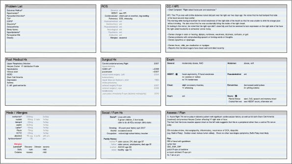
Let’s return to the same EHR-generated text-based chart note we’ve been considering and investigate how well it maximizes the data-ink ratio. The mockups shown below are a composite design based on several widely used EHRs.

In order to see the mockups and read the accompanying text, enlarge them to full screen size by clicking on the ‘full screen’ button clip_image001in the lower right corner of the SlideShare frame below.

Rick Weinhaus, MD practices clinical ophthalmology in the Boston area. He trained at Harvard Medical School, The Massachusetts Eye and Ear Infirmary, and the Neuroscience Unit of the Schepens Eye Research Institute. He writes on how to design simple, powerful, elegant user interfaces for electronic health records (EHRs) by applying our understanding of human perception and cognition. He welcomes your comments and thoughts on this post and on EHR usability issues. E-mail Dr. Rick.

EHR Design Talk with Dr. Rick 4/1/13

April 1, 2013 Rick Weinhaus 3 Comments

The Text-Based Workaround

We have been considering two fundamentally different designs for presenting a patient’s past and present medical issues over time — the Snapshot-in-Time design and the Overview-by-Category design.

I have tried to make the case that the Snapshot-in-Time design, although rarely used as a high-level EHR paradigm, does a much better job than the widely adopted Overview-by-Category design for two reasons:

1) Clinicians think of the patient’s health as a story – a narrative of how things got to be the way they are. Each patient’s story is rich, complex, and unique. By presenting the patient’s story as a series of snapshots in time, this rich narrative gradually unfolds, a little like turning the pages of a picture book.

2) The Snapshot-in-Time design, when combined with assigning each category of data to a fixed location on the screen or page (see Why T-Sheets Work), allows us to take it in and process information using the fast visual processing part of our brain. In contrast, the Overview-by-Category design compels us to use slower cognitive processing.

In my last post, I wrote that perhaps due to the limitations inherent in the Overview-by-Category design, most EHRs that employ it also provide a workaround solution. This workaround is nothing other than a text-based chart note generated by the EHR.

For each patient encounter, the EHR can generate a single, relatively comprehensive text-based document assembled from the previously-entered structured data.

These text-based documents are typically in Microsoft Word or PDF format. They can be viewed on the monitor from within the EHR application, printed, or sent electronically as PDFs.

Although these text-based EHR chart notes are snapshots in time (unlike the Overview-by-Category EHR screens), they usually have significant problems, including:

  • low data density
  • non-interactive design
  • poor spatial organization and layout

In this and the next several posts, I will address these issues by presenting mockups of text-based chart notes, based on the design of several well-known EHRs.

The mockups use the same patient database that I used for the Snapshot-in-Time and the Overview-by-Category mockups. While these examples are for an ambulatory patient, similar designs are common in hospital-based EHR systems.

In order to see the mockups and read the accompanying text, enlarge them to full screen size by clicking on the ‘full screen’ button clip_image001 in the lower right corner of the SlideShare frame below.

Rick Weinhaus MD practices clinical ophthalmology in the Boston area. He trained at Harvard Medical School, The Massachusetts Eye and Ear Infirmary, and the Neuroscience Unit of the Schepens Eye Research Institute. He writes on how to design simple, powerful, elegant user interfaces for electronic health records (EHRs) by applying our understanding of human perception and cognition. He welcomes your comments and thoughts on this post and on EHR usability issues. E-mail Dr. Rick.

EHR Design Talk with Dr. Rick 1/7/13

January 7, 2013 Rick Weinhaus Comments Off on EHR Design Talk with Dr. Rick 1/7/13

The Overview-by-Category Design

We have been considering two alternative high-level EHR designs for organizing a patient’s data over time – the Snapshot-in-Time design and the Overview-by-Category design.

In a recent post, I made the argument that the Snapshot-in-Time design supports our mental model of how a dynamic system, such as a patient’s state of health, changes over time.

In my last post, I proposed that the user interface (UI) that results from the Snapshot-in-Time design supports how the human visual system takes in and processes information.

While the Snapshot-in-Time design is at the core of much paper-based medical charting (see Why T-Sheets Work), for a number of reasons — only some of them due to technical limitations — it has not been widely adopted as a high-level EHR design. Instead, most EHRs employ an Overview-by-Category design.

The Overview-by-Category design places emphasis on the patient’s present state of health. A single summary screen displays multiple categories of EHR data (History of Present Illness, Assessment and Plan, Medications, etc.) each as a separate pane or table containing time-stamped data from both present and past encounters.

In my opinion, the Overview-by-Category design has several fundamental limitations:

  • The patient’s story does not unfold as a narrative.
  • Significant cognitive and mouse / keystroke effort is required to make sense of how entries in the different categories fit together.
  • The overview screen tries to convey too much information. To see details, the user either has to scroll within the tables (see The Problem with Scrolling), to scroll the overview screen itself, or to navigate to entirely different screens (see Humans Have Limited Working Memory).

To help compare the two designs, I have constructed mockups below based on the Overview-by-Category design, using exactly the same patient database that I used for the Snapshot-in-Time mockups in my last post.

The Overview-by-Category mockups below are based on a widely-used EHR. While these illustrations are for an ambulatory patient, similar designs are common in hospital-based EHR systems.

In order to see the mockups and read the accompanying text, enlarge them to full screen size by clicking on the ‘full screen’ button

clip_image002

in the lower right corner of the SlideShare frame below.

Rick Weinhaus MD practices clinical ophthalmology in the Boston area. He trained at Harvard Medical School, The Massachusetts Eye and Ear Infirmary, and the Neuroscience Unit of the Schepens Eye Research Institute. He writes on how to design simple, powerful, elegant user interfaces for electronic health records (EHRs) by applying our understanding of human perception and cognition. He welcomes your comments and thoughts on this post and on EHR usability issues. E-mail Dr. Rick.

EHR Design Talk with Dr. Rick 12/3/12

December 3, 2012 Rick Weinhaus 6 Comments

The Snapshot-in-Time Design

There are two basic EHR designs for presenting the patient information that accumulates over time (see my last post).

By far, the most common EHR design solution is to display a summary screen of the patient’s current health information, organized by category (Problem List, Past Medical History, Medications, and so forth). Past information is available in date-sorted lists or indicated by start and stop dates.

The other design solution is to display a series of snapshots that capture the state of the patient’s health at successive points in time. While this design was at the core of paper-based charting (see Why T-Sheets Work), it is an uncommon EHR design.

In my opinion, the snapshot-in-time design has three advantages:

  • It supports our notion of causality – we see how earlier events affect subsequent ones.
  • The patient’s story is presented as a narrative that gradually unfolds. Humans excel at using narrative to organize and make sense of complex data.
  • Perhaps most importantly, a series of visual snapshots allows us to makes sense of abstract data by organizing it in visual space.

The following EHR screen mockups display a patient’s story as snapshots in time. While these illustrations are for an ambulatory EHR, the design works equally well for hospital-based systems.

To see the mockups, click on the PowerPoint link below. Once PowerPoint is open, expand the view by clicking on the full screen button in the lower right corner (indicated by arrow).

clip_image002


Rick Weinhaus MD practices clinical ophthalmology in the Boston area. He trained at Harvard Medical School, The Massachusetts Eye and Ear Infirmary, and the Neuroscience Unit of the Schepens Eye Research Institute. He writes on how to design simple, powerful, elegant user interfaces for electronic health records (EHRs) by applying our understanding of human perception and cognition. He welcomes your comments and thoughts on this post and on EHR usability issues. E-mail Dr. Rick.

EHR Design Talk with Dr. Rick 10/15/12

October 15, 2012 Rick Weinhaus Comments Off on EHR Design Talk with Dr. Rick 10/15/12

The View of the Patient over Time

Until now, all of my posts have dealt with EHR user interface designs for a single patient encounter. In other words, they have been designs for displaying a snapshot of the patient’s health at a single point in time.

An electronic health record, however, is fundamentally a longitudinal record – a record that includes both the present and the past medical history. The record is updated as events, interventions, and health changes occur.

The electronic health record can be thought of as a cognitive tool for understanding and reasoning about these past and present health events to make the best decisions going forward. If you accept this premise, then in rethinking EHR design, even before considering usability or functionality, the most important question should be:

What user interface designs do the best job of presenting the patient’s past and present history and findings? How does a physician make sense of all the disparate information that accumulates in a patient’s chart over time?

There are two fundamentally different EHR user interface designs for presenting a patient’s story.

The design used by most EHRs places emphasis on the patient’s present state of health. In this design, each category of data (Problem List, Medications, Allergies, Procedures, and so forth) is maintained as a separate list. The lists are updated as events occur. Each event in a list has a start date associated with it – for instance, "Lipitor started 12/12/2008." Past events in the lists are indicated by stop dates or by designations such as "resolved" or "discontinued."

I might state this model formally as:

The patient’s current health information is the most important determinant of his or her future health. The patient’s current health status is best organized and understood as a set of categories that contain up-to-date lists of both present and past information. While it is essential to work with an up-to-date record of the patient’s current health problems, it is not necessary to be able to retrieve snapshots of what the record looked like in the past.

I believe, however, that both the patient and the physician think about the patient’s health very differently – as a series of inter-related events that unfold over time. It is fundamentally a story, a narrative of how things got to be the way they are. The story has the capacity to convey all the richness, complexity, and uniqueness of each patient.

A powerful way of telling and understanding the patient’s story is to present each point in time as a single screen view – a snapshot of the patient’s health at that time. The patient’s story can then be understood by stepping through the screen views in sequence, similar to turning the pages of a paper chart where each event or encounter is documented on a separate paper form which gets appended to the previous pages in chronological order (see my post on Why T-Sheets Work).

It’s also a little like turning the pages of a picture book or viewing the frames of a story board for a film – the patient’s story gradually unfolds.

I might state this model formally as:

The patient is a complex biological organism whose health changes over time. Every health event, intervention, procedure, and change in behavior potentially has an effect on all subsequent health events. The best way to comprehend the patient’s health issues is to treat the record as a narrative that unfolds over time and to present that narrative as a series of snapshots.

In the abstract, the difference between these two models may seem academic. In practice, there are profound implications for how easy or difficult it is to grasp and reason about a patient’s health issues. More on this in my next post …

Rick Weinhaus MD practices clinical ophthalmology in the Boston area. He trained at Harvard Medical School, The Massachusetts Eye and Ear Infirmary, and the Neuroscience Unit of the Schepens Eye Research Institute. He writes on how to design simple, powerful, elegant user interfaces for electronic health records (EHRs) by applying our understanding of human perception and cognition. He welcomes your comments and thoughts on this post and on EHR usability issues. E-mail Dr. Rick.

EHR Design Talk with Dr. Rick 9/17/12

September 17, 2012 Rick Weinhaus 7 Comments

A Single-Screen EHR Design for the Patient Encounter

The benchmark . . . for all navigation techniques should be the saccadic [rapid] eye movement. This allows us to acquire a new set of informative visual objects in 100-200 [milliseconds]. Moreover, information acquired in this way will be integrated readily with other information that we have recently acquired from the same space. Thus, the ideal visualization is one in which all the information for visualization is available on a single high-resolution screen. – Colin Ware, Information Visualization: Perception for Design

I would like to bring together some of the user interface designs we have been considering and propose for discussion a single-screen EHR design for a patient encounter. Before presenting the design itself, it is useful to recall the design concepts covered in previous posts:

  • The human visual system is very good at organizing data spatially (Why T-Sheets Work; Pane Management – Part 2).
  • We excel at grasping patterns and seeing relationships among data elements when they are presented in a single view, but have limited capacity to remember these elements when they are distributed across multiple screens (Humans Have Limited Working Memory).
  • The most efficient way to navigate visual space is by using rapid (saccadic) eye movements (Fitts’ Law).
  • Using a large, high-resolution screen supports navigation by saccadic eye movement (Pane Management – Part 1).
  • When we do need to navigate using a mouse or other input device, we can reduce the cognitive costs by making the targets large and reasonably close (Fitts’ Law).
  • It is often easier to grasp patterns visually than mathematically or verbally (Computer-Centered versus User-Centered Design).
  • It’s easier to find patterns and solve problems with data presented compactly and grouped visually – using columns, rows, and formatting – than with data presented as free text (Pane Management – Part 1).
  • Using vertical and horizontal scrollbars to navigate small panes requires cognitive effort and doesn’t solve the working memory problem (The Problem with Scrolling). It is preferable to display an overview of the data and use mouse hovers or clicks to display details as needed (Overview with Details on Demand).

The Design

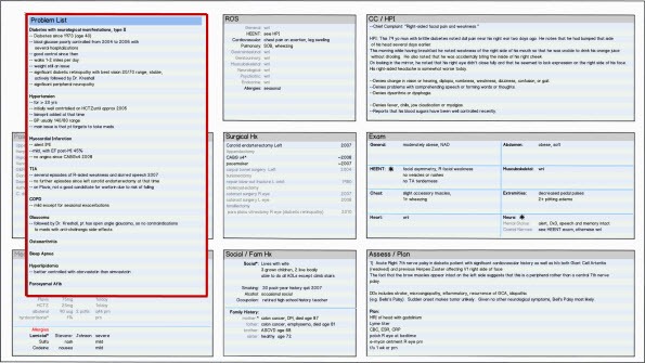
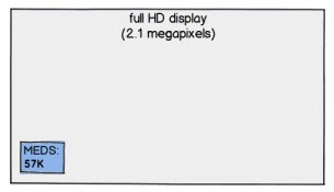
A large single screen with high resolution, for instance 1920 x 1080 pixels (full HD), is used to display all the categories of data for a patient encounter on a particular date. Each category of data is assigned to a pane of fixed size and location on the screen:

EHRDT11 fig01 595x335

Because humans are able retain about nine spatial locations in visual working memory (although we can only remember simple visual objects or patterns contained in about three to five of them), a set of nine panes arranged in a 3×3 grid was chosen for the high-level design.

The figure below shows this same screen design populated with data from a patient encounter:

EHRDT11 fig02 595x335


Click on the thumbnail below to see the design at higher (but not full) resolution:

EHRDT11 fig03 1920x1080

The figure below shows the Problem List pane:

EHRDT11 fig04 600x320

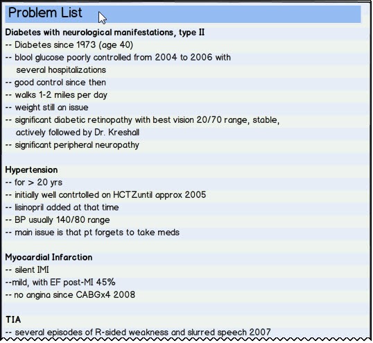
A marker (for instance, an asterisk) indicates that more detail is available for a data field. Detail can be displayed by hovering or clicking, as shown below for Diabetes Mellitus:

EHRDT11 fig05 600x320

and for transient ischemic attack (TIA):

EHRDT11 fig06 600x320

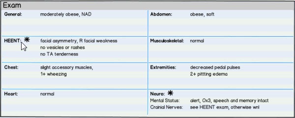
The same high-level design is used for all panes, as in the Exam pane below (size slightly reduced):

EHRDT11 fig07 600x240

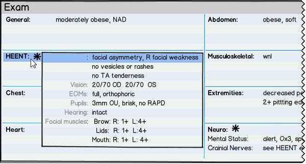
Again, hovering over or clicking on a line with an asterisk brings up more detail for that data field:

EHRDT11 fig08 600x322

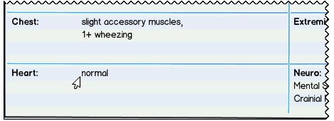
The design allows default or normal findings to be summarized:

EHRDT11 fig09 469x170

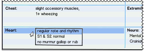
while still making the full default text available on demand:

EHRDT11 fig10 468x171

Expanded Panes:

As an alternative to expanding individual data fields, all the data fields within a pane can be simultaneously expanded by hovering or clicking on the pane’s title bar, as shown below for the Problem List:

EHRDT11 fig11 538x494

An expanded pane will necessarily obscure adjacent panes, as below:

EHRDT11 fig12 595x335

Even in this case, context is at least partially preserved because of the large high-resolution screen.

Design Considerations

Expanded data fields:

  • In order to maintain as much context as possible, data fields within an individual pane expand only to the minimum size required.
  • More than one data field within a pane can be expanded at the same time, provided that the expanded fields don’t overlap.

Expanded panes:

  • In order to maintain as much context as possible, panes expand only to the minimum size required.
  • More than one pane can be expanded at the same time, provided that the expanded panes don’t overlap.
  • The same single-screen design is used both for data entry and subsequent data review. Any pane can expand for data entry and then contract to its original size.

I would propose that this kind of single-screen design for a patient encounter, with all its interactive capability both within panes and among panes, should be thought of as the chart note. In this design, there is no separate text-based or PDF "completed note," except as needed for use outside the EHR.

The design above is a sketch – a design being considered, reformulated, and reworked. I tried to design it based on an understanding of how the human brain best takes in, processes, and organizes information. Its purpose is to generate discussion and debate. I look forward to your comments and suggestions.

Finally, there is a major caveat that comes along with the single-screen design presented here. A patient’s electronic health record is a longitudinal record, while the design above represents a snapshot in time. More on this in coming posts.

Rick Weinhaus MD practices clinical ophthalmology in the Boston area. He trained at Harvard Medical School, The Massachusetts Eye and Ear Infirmary, and the Neuroscience Unit of the Schepens Eye Research Institute. He writes on how to design simple, powerful, elegant user interfaces for electronic health records (EHRs) by applying our understanding of human perception and cognition. He welcomes your comments and thoughts on this post and on EHR usability issues. E-mail Dr. Rick.
EHR Design Talk with Dr. Rick 8/13/12

August 13, 2012 Rick Weinhaus 11 Comments

Fitts’ Law and the Small Distant Target

“. . . the importance of having a fast, highly interactive interface cannot be emphasized enough. If a navigation technique is slow, then the cognitive costs can be much greater than just the amount of time lost, because an entire train of thought can become disrupted by the loss of contents of both visual and non-visual working memories." — Colin Ware, Information Visualization: Perception for Design

Paul Fitts was the pioneering human factors engineer whose work in the 1940s and 50s is largely responsible for the aircraft cockpit designs used today. His life’s work was focused on designing tools that support human movement, perception, and cognition.

In 1954, he published a mathematical formula based on his experimental data that does an extremely good job of predicting how long it takes to move a pointer (such as a finger or pencil tip) to a target, depending on the target’s size and its distance from the starting point.

Fitts’ Law has turned out to be remarkably robust, applicable to most tasks that rely on eye-hand coordination to make rapid aimed movements. Although digital computers as we know them did not exist when Fitts published his formula, since then his law has been used to evaluate and compare a wide range of computer input devices as well as competing graphical user interface (GUI) designs. In fact, research based on Fitts’ Law by Stuart Card and colleagues at the Palo Alto Research Center (PARC) in the 1970s was a major factor in Xerox’s decision to develop the mouse as its preferred input device.

As you would expect, Fitts found that it takes longer to move a pointer to a smaller target or a more distant one. The interesting thing is that the relationship is not linear.

If a target is small, a small increase in its size results in a large reduction in the amount of time needed to reach it with the pointer. Similarly, if a target is already close to the pointer, a small further decrease in its distance results in a large reduction in the amount of time required to reach it.

Conversely, if a target is already reasonably large or distant, a small increase in its size or small decrease in its distance has much less effect.

What is Fitts’ Law telling us? Why isn’t the relationship linear? Are the two tasks fundamentally the same or are they different, requiring different visual, motor, and cognitive strategies?

8-13-2012 6-40-04 PM

Perhaps the best way to get a feel for this aspect of Fitts’ Law is to try it yourself. If you have two minutes to spare, click on the link below for an online demo. You will see two vertical bars, one blue and one green. The green one is the target. Your goal is to use your cursor to move to and click on the green bar, accurately and rapidly, each time it changes position.

As you go through the demo, imagine that the bars represent navigation tabs or buttons in an EHR program. In other words, imagine that your real goal is to view EHR data displayed on several screens—clicking on the green target is just the means to navigate to those screens.

You will see some text displaying a decreasing count: hits remaining — XX. Keep track of this hit count while moving to and clicking on the green target. This task will have to stand in for the more challenging one of remembering what was on your last EHR screen (see my post on limited working memory).

When you finish, you can ignore the next screen, which displays your mean time, some graphs, and a button to advance to a second version of the demo.

Here’s the link to the online demonstration of Fitts’ Law.

What did you find?

You probably found that if the green target was sufficiently wide and close to the cursor, you could hit it in a single "ballistic" movement. In other words, with a ballistic movement, once your visual system processes your starting position and the target location, other parts of your brain calculate the trajectory and send a single burst of motor signals to your hand and wrist. The movement itself is carried out in a single step without the need for iterative recalibration or subsequent motor signals.

Your brain used the same strategy as the one used for ballistic missiles. The missile is simply aimed and launched, with no in-flight corrective signals from the control center.

Conversely, you probably found that if the green target was narrow and far from the cursor, you couldn’t use a ballistic strategy. After initiating the movement, most likely you had to switch your gaze to the cursor, calibrate its new screen location in relation to the target, calculate a modified trajectory, send an updated set of motor signals to your hand, and so forth in iterative loops, until reaching the target.

These two strategies are fundamentally different. Not only does the ballistic movement take less time, it requires much less cognitive effort. In fact, if the target is large and close enough to your cursor, you can make a ballistic hand movement using your peripheral visual field while keeping your gaze and attention on the screen content.

These differences between ballistic movements and those requiring iterative feedback may explain the non-linear nature of Fitts’ Law.

As I discussed in a previous post, the rapid "saccadic" eye movements we use to redirect our gaze are the benchmark against which all other navigation techniques should be measured. Not surprisingly, these saccadic eye movements, lasting about a tenth of a second, are ballistic. Once the brain has made the decision to redirect gaze, it calculates a trajectory and sends a burst of neural signals causing our eye muscles to turn the eyes to the new target and simultaneously preparing our visual processing system to expect input from that new location.

It makes sense that saccadic eye movements are ballistic. We want to turn our eyes to the new fixation point as quickly and effortlessly as possible. In fact, we take in no visual information whatsoever during the saccade itself. We only acquire visual information between saccades, when our gaze is fixed on an item of interest.

From an evolutionary standpoint, it would appear that saccadic eye movement, being more rapid and efficient than iterative strategies, was selected as our primary means of navigating visual space. If we want our digital input devices and interactive designs to approach the efficiency of saccadic eye movement, we should create user interfaces that facilitate ballistic strategies.

Returning to the vendor’s design presented in my last post, the "maximize" buttons, shown below outlined with red circles, are both tiny and distant:

8-13-2012 6-41-54 PM

There is no way we can move the cursor from one maximize button to another (except for the adjacent ones) using a ballistic strategy, whereas the design below, using a separate navigation map, supports such a strategy:

8-13-2012 6-42-41 PM

Of course, all design choices require trade-offs. The second design requires a major compromise. By requiring a separate navigation map, it adds another level of complexity to the user interface.

It’s not usually the case that one high-level design is good and another isn’t. Most high-level designs have their advantages. But if you are going to stick with the vendor’s design, at least use the entire area of the title bars as the targets. If you are going to use a separate navigation map, make the panes large and close enough for a ballistic strategy to work.

To be clear, the problem is not the extra second or so that it takes to acquire a small, distant target. It’s that poor designs cause the user to break concentration and use working memory for non-medical tasks. An unnecessarily difficult navigation operation can disrupt the train of thought needed to apply good medical judgment to an individual patient.

Quite simply, when designing EHR interfaces, many choices are not a question of preference or aesthetics. We are hard wired so that certain tasks are simply easier than others. Our EHR design choices need to be informed by an understanding of these human factors.

Next post:

A Single-Screen Design

Rick Weinhaus MD practices clinical ophthalmology in the Boston area. He trained at Harvard Medical School, The Massachusetts Eye and Ear Infirmary, and the Neuroscience Unit of the Schepens Eye Research Institute. He writes on how to design simple, powerful, elegant user interfaces for electronic health records (EHRs) by applying our understanding of human perception and cognition. He welcomes your comments and thoughts on this post and on EHR usability issues. E-mail Dr. Rick.

EHR Design Talk with Dr. Rick 7/23/12

July 23, 2012 Rick Weinhaus 7 Comments

Pane Management — Part 2

The human visual system evolved over tens of millions of years to help our ancestors keep track of and interact with real objects in the physical world. To the extent that an EHR user interface design can harness our finely honed visual-spatial capabilities, using it will be intuitive and nearly effortless, even though the "space" we are navigating is that of data and the "objects" we are manipulating are abstract concepts.

Unless acted upon, objects in our physical world don’t move around, get larger or smaller, or change their orientation in relation to other objects. The human visual system "understands" these properties of the physical world. We are very good at constructing mental maps of what we see and using those maps to keep track of how objects are organized in space.

Unfortunately, graphical user interface (GUI) designs are not bound by the laws of physics and the constraints of the physical world. When we manipulate one object on the screen, other screen objects, for no apparent reason, can disappear and suddenly re-appear in different locations or radically change their shape and orientation.

While we might enjoy an altered set of physical rules as part of the challenge of playing a video game, it would be disconcerting, to say the least, to encounter such behavior in an EHR user interface.

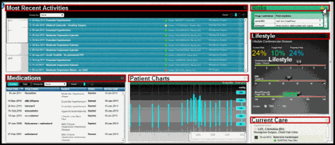
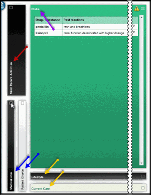
Consider the EHR design below, by a well-known healthcare software toolkit developer.

clip_image002

Above is the physician’s home screen for a particular patient. Six panes are used to display six categories of patient data — Most Recent Activities, Medications, Patient Charts, Risks, Lifestyle, and Current Care. For clarity, I have enlarged the font size and drawn red boxes around the title bar of each pane.

Each pane is assigned to a particular location on the screen. One at a time, each pane can be expanded and then contracted by using the mouse cursor to click on the "maximize" button at the far right of its title bar (see Risks pane above).

So far so good. But look at what happens to the other panes below when I do expand one pane, such as the Risks pane (purple arrow). For clarity, I have significantly shortened the horizontal span of the screen in the next two figures:

clip_image004

When I expand the Risks pane, all the other panes close so that just their title bars are displayed. Worse, they all change their position, size, and orientation. The Most Recent Activities pane (red arrow) and the Medications and Patient Charts panes (blue arrows) are now oriented vertically along the far left of the screen. The Most Recent Activities pane is twice the width of the others.

The Lifestyle and Current Care panes (yellow arrows) maintain their horizontal orientation and relative position, but have been shifted to the bottom of the screen and stretch along its entire extent.

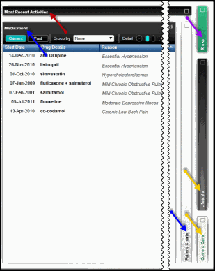
If I need to expand another pane, such as the Medications pane (indicated by the blue arrow below), all the other panes again change their position, size, and orientation:

clip_image006

With the Medications pane expanded, the Most Recent Activities pane (red arrow) is now oriented horizontally instead of vertically and extends along the entire top of the screen.

The Patient Charts pane (bottom blue arrow) keeps its vertical orientation, but now is displayed on the right side of screen, elongated to span the entire screen height. The Lifestyle and Current Care panes (yellow arrows) change from horizontal to vertical orientation as does the contracted Risks pane (purple arrow). In addition, the Lifestyle pane has been stretched vertically.

In fact, whenever any pane is expanded, the other, non-expanded panes somewhat arbitrarily change their position, size, and orientation in this way. This is a poor mapping. It doesn’t correspond to our mental model of the physical world. It doesn’t take advantage of our highly evolved ability to organize objects in visual space.

Instead of the design above, why not use a small overview map for orientation and navigation, as in the figure below?

clip_image008

This is a more natural mapping. The positions of the six panes in this small overview map correspond to those of the home screen (first figure) and those positions remain constant regardless of which pane is expanded. Furthermore, this overview map (overlaid below, for comparison, in the lower right corner of the expanded Risks pane) takes up less than 3% of the screen area, whereas the vendor’s design (outlined by the yellow border below) uses almost 20%:

clip_image010

It’s not that physicians and other users can’t work with problematic EHR interfaces such as this one. Humans are remarkably adaptable and flexible, but it requires cognitive effort. It’s not just the extra second or so that it takes to find a pane in its new location. That’s the least of it.

The real problem is that, unlike computers, humans have extremely limited working memory. Having to deal with the shifting location, size, and orientation of data objects is disorienting.

Whenever we use a slot in our visual working memory for these kinds of tasks, we can no longer use that slot for clinically relevant information. It’s easy to underestimate how much this kind of EHR interface can interfere with our ability to make sense of complex patient data in the clinical setting.

Rick Weinhaus MD practices clinical ophthalmology in the Boston area. He trained at Harvard Medical School, The Massachusetts Eye and Ear Infirmary, and the Neuroscience Unit of the Schepens Eye Research Institute. He writes on how to design simple, powerful, elegant user interfaces for electronic health records (EHRs) by applying our understanding of human perception and cognition. He welcomes your comments and thoughts on this post and on EHR usability issues. E-mail Dr. Rick.
EHR Design Talk with Dr. Rick 6/20/12

June 20, 2012 Rick Weinhaus 13 Comments

Special Edition: The ONC/NIST Workshop on Creating Usable EHRs — Part 2

If you ask clinicians which aspects of their EHRs drive them nuts, many can tell you in some detail. On the other hand, if you ask them how to improve those EHR designs, most cannot articulate the issues in ways that would lead to fundamental change. Relying on focus groups and implementing user requests turn out to be similarly unproductive.

If these methods don’t work, how should one design EHR software that meets the goals and needs of its users and thereby improves healthcare?

There are no simple answers. After all, EHR software is a very new cognitive tool.

An alternative to asking users for advice and feedback is to apply rational design methods collectively referred to as User-Centered Design (UCD). This was the focus of last month’s ONC/NIST Workshop.

Since my last post, I’ve been thinking a lot about the term User-Centered Design because it has two distinct definitions.

On the one hand, it can mean design based on our understanding of how the human brain best takes in, organizes, and processes information — in other words, Human-Centered Design. By this definition, UCD encompasses not just usability testing, but also the findings and methods of a number of related fields, including interaction design, data visualization, cognitive science, and human factors.

On the other hand, the term User-Centered Design can refer to a relatively codified method of software design that places emphasis on setting user performance objectives, conducting iterative user testing during development, and ultimately performing formal summative usability testing to evaluate the end product.

I prefer the first definition because it places more emphasis on the design process itself. A design process that brings together the findings and methods of several fields is more likely to foster innovative solutions. One comprehensive design approach I particularly like is Goal-Directed Design, as described by Alan Cooper, Kim Goodwin, and colleagues in their complementary books About Face 3 and Designing for the Digital Age.

The next question is what role, if any, should ONC play in regard to User-Centered Design and EHR usability. There are two basic philosophies on how to improve EHR design and safety.

One approach is to encourage innovation by allowing market forces, including those created by disruptive innovation, to work. The other approach is to regulate the evaluation process — for instance, to require summative usability testing, to have the FDA regulate EHRs as medical devices, and so forth.

While everyone wants safer EHR designs, in practice it’s not clear to me that more regulation will help. Because of the complex and interactive nature of software user interfaces, evaluating the safety of EHRs is orders of magnitude more difficult than evaluating the safety of physical devices.

An EHR can follow a long list of guidelines, pass all kinds of usability testing, and still present the user with terribly problematic interfaces. After having studied the NIST, AHRQ, and HIMSS documents related to EHR usability, I don’t see how mandating formal usability testing is going to make EHRs safer.

For one thing, one usability guideline inevitably conflicts with another. Furthermore, while summative usability testing is reliable and yields quantitative data, exactly what gets tested is highly subjective. Third, evaluating the safety of EHR software is a moving target, as the software development tools, the design patterns, and the platforms are all changing rapidly.

It is clear that ONC has been considering the role it should play in regard to EHR usability. While we don’t know what ONC’s final rules on User-Centered Design will be, we can glean some information from last month’s workshop.

In their presentations, National Coordinator Farzad Mostashari and ONC’s recently appointed acting Chief Medical Officer, Jacob Reider, made the following points:

  • The UK model, mandating a particular EHR design, clearly didn’t work.
  • Getting feedback from clinicians is generally a poor way to improve EHR design. As Henry Ford remarked about his cars, “If I had asked people what they wanted, they would have said faster horses.” The UCD process, broadly defined, is a better way to improve design.
  • Market forces should work. The more usable EHRs will be the successful ones. Vendors who understand these issues will make User-Centered Design a high priority instead of focusing on new "bells and whistles."
  • It has taken the aviation industry a hundred years to learn how to build safe planes. Health Information Technology (HIT) is a young industry. Transformation will not occur overnight.
  • ONC does not see its role as defining how an EHR should look and feel. Rather, its main concern regarding usability is safety.
  • The tradeoff between innovation and safety is not a "zero-sum game." With more usable designs, everybody wins.

It would appear this same perspective is reflected in ONC’s March 2012 Notice of Proposed Rule Making (pp. 13842-3). First of all, ONC proposes to limit the UCD process to eight certification criteria, all related to the high-risk area of medications. Secondly, the notice states:

… we believe that a significant first step toward improving overall usability is to focus on the process of UCD. While valid and reliable usability measurements exist … we are concerned that it would be inappropriate at this juncture for ONC to seek to measure EHR technology in this way … Presently, we believe it is best to enable EHR technology developers to choose their UCD approach and not to prescribe one or more specific UCD processes that would be required to meet this certification criterion.

Unless innovative designs are allowed to emerge, the next generation of EHR user interfaces will continue to have all the major usability problems of our current ones. From my perspective as a physician EHR user who also thinks and writes about EHR design, I’d say that ONC got its User-Centered Design policy just about right.

Rick Weinhaus MD practices clinical ophthalmology in the Boston area. He trained at Harvard Medical School, The Massachusetts Eye and Ear Infirmary, and the Neuroscience Unit of the Schepens Eye Research Institute. He writes on how to design simple, powerful, elegant user interfaces for electronic health records (EHRs) by applying our understanding of human perception and cognition. He welcomes your comments and thoughts on this post and on EHR usability issues. E-mail Dr. Rick.
EHR Design Talk with Dr. Rick 6/4/12

June 4, 2012 Rick Weinhaus 13 Comments

Special Edition: The ONC/NIST Workshop on Creating Usable EHRs — Part 1

On May 22, ONC and the National Institute of Standards and Technology (NIST) jointly sponsored a workshop in Gaithersburg, Maryland on Creating Usable EHRs: A User-Centered Design Best Practices Workshop.

If any major vendor CEOs had attended, I think they would have come away with the mission to make EHR usability, defined broadly, a top priority of their organization.

In his opening remarks, Farzad Mostashari, National Coordinator for Health Information Technology, noted that when talking with clinicians across the country, the number one issue he hears is that their EHR is unusable, that "the system is driving me nuts."

Broadly speaking, EHR usability is about suiting EHR design to human requirements and abilities, not the other way around. I’ll start by giving three examples.


Example #1

Pediatric cardiologist David Brick presented an error-prone EHR design that could lead to a catastrophic result in a safety critical environment, a neonatal ICU. In the medication module of the EHR, the column containing the names of the medications is too narrow, presumably to conserve screen space. Consequently, the names of medications are truncated. In the example below, the truncated forms of the medications amiodarone and amlodipine are visually similar.

image

Administering amlodipine to a neonate when amiodarone was intended is an error with potentially fatal consequences. One can see how a neonatologist might confuse the two, especially in a high-stress clinical setting.


Example #2

As part of his talk, Bentzi Karsh, Professor of Industrial and Systems Engineering at the University of Wisconsin-Madison, conducted an audience-participation experiment by presenting the same data set in two different formats. (The 2 figures that follow are printed with permission from Sue M Bosley, PharmD, CPPS.) Our task was to determine as quickly as possible how many of the lab values were outside the normal range for the patient below. Try it:

6-4-2012 7-54-02 PM

In the view above, it took us anywhere between 15 and 45 seconds to determine the number of out-of-range labs and 20% of us came up with the wrong number. Furthermore, we were so focused on the task at hand that not one of the 150 of us noticed that the patient was a dog.

Then the same data was presented in a format better optimized for visual processing:

6-4-2012 7-54-57 PM

Using the visual display of the same information, we all identified the out-of-range lab value in less than 3 seconds and there were no errors.


Example #3

The third example comes not from a presentation, but from a conversation over lunch with fellow attendees of the workshop. Jared Sinclair, an R.N. and developer of iOS applications for bedside nursing, was telling us about a widely-used workaround that hospital-based nurses have devised to deal with an EHR design problem.

One of the major tasks of hospital-based nurses is to make sure that each patient assigned to them gets the right medications at the right time of day. The EHR medication screen view that nurses see is called a Medication Administration Record (MAR). It serves both as a schedule for administration and as a tool to document whether and when medications were actually given. Jared was kind enough to create the MAR mock-ups below (shown as an overview and then a zoomed-in view) based on the design of several widely-used EHRs:

6-4-2012 7-55-59 PM

6-4-2012 7-56-48 PM

What nurses need for each patient, however, is a portable list of medications organized by the time of day those medications should be administered. Because most EHRs don’t provide this alternate view of the data, at the beginning of every shift nurses create their own paper-based lists (see example below):

6-4-2012 7-57-31 PM

***

Each of the three examples above represents a disparate aspect of EHR usability. The fact that they are so different helps explain why designing usable EHRs is so difficult.

Further complicating the discussion is the fact that usability can be defined in a number of ways. If usability is narrowly defined, it can focus on the kinds of issues in example #1 to the exclusion of the kinds of issues in examples #2 and #3, which in fact may represent greater risks to patient safety.

The three examples above just scratch the surface of the EHR usability problem. To better understand these issues, I recommend a superb viewpoint paper in JAMIA discussing EHR usability and related issues. The two lead authors, Bentzi Karsh and Matt Weinger,  spoke at the workshop. Their points are easy to follow. In my opinion, their paper should be required reading for vendors, administrators, and clinicians alike.

Broadly speaking, the field of usability can be divided into two parts:

  • User-Centered Design (UCD), which deals with the design process, and
  • Summative Usability Testing, which evaluates and validates designs toward the end of the design process.

While these two components can be seen as parts of a continuum, in practice it is helpful to separate them.

I was glad to see that the ONC/NIST workshop focused on User-Centered Design – the process of creating usable EHRs – as opposed to focusing narrowly on testing protocols. Of more consequence, in its March 2012 Notice of Proposed Rule Making (pp. 13842-3), ONC states that a significant first step toward improving overall usability is to focus on the process of UCD (as opposed to mandating formal summative testing).

For me, there are two major questions:

1) What exactly is User-Centered Design (UCD)?

2) What role, if any, should ONC play in regard to UCD and EHR usability?

I look forward to sharing my thoughts on these issues in my next post.

Rick Weinhaus MD practices clinical ophthalmology in the Boston area. He trained at Harvard Medical School, The Massachusetts Eye and Ear Infirmary, and the Neuroscience Unit of the Schepens Eye Research Institute. He writes on how to design simple, powerful, elegant user interfaces for electronic health records (EHRs) by applying our understanding of human perception and cognition. He welcomes your comments and thoughts on this post and on EHR usability issues. E-mail Dr. Rick.
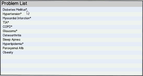
EHR Design Talk with Dr. Rick 5/14/12

May 14, 2012 Rick Weinhaus 6 Comments

Pane Management — Part 1

The quantity of detail is an issue completely separate from the difficulty of reading. Clutter and confusion are failures of design, not attributes of information.

— Edward Tufte, Envisioning Information

We’ve been considering a high-level EHR user interface design that employs multiple panes within a single screen to display all the categories of data in a patient encounter.

In my last post, I discussed how mouse hovers or clicks can be used to expand and contract panes as needed. Excellent reader comments by Dr. Gregg and Dr. Robert Lafsky have made it clear it would be helpful to explore the limits of how much EHR data can be effectively displayed within an unexpanded pane.

In other words, can a relatively small pane present information at a high data density without creating clutter and confusion? Can multiple panes on a single screen be used to display most of the relevant data for a patient encounter, even before expanding or moving panes?

In my T-Sheet post, we explored one advantage of a single page or single screen view of the data. Each category of data is assigned to a fixed location on the page, allowing us to organize abstract data using our highly-evolved capacity to remember things by their spatial location.

A second advantage of a single page or single screen view is that we can rapidly access information by simply redirecting our gaze toward any part of the display. These rapid eye movements, lasting about a tenth of a second, are so integral to the way we take in and process information that most of the time we are not even aware of them.

Because data anywhere on a single page or screen is immediately available by using these ‘saccadic’ eye movements, we can simply retrieve it rather than remember it. Thus, the single screen design largely eliminates both the working memory problem and the cognitive costs of navigation. It also reduces complexity by reducing the total number of EHR screens needed.

For a single screen design to work, however, the individual panes need to be thoughtfully designed. Each pane needs to present a high density of data without clutter. We have already seen one problematic pane design, based on scrolling, that does neither.

Let’s return to the medication data set we’ve been working with. Here is the first part of the medication screen:


5-14-2012 7-02-00 PM


This design has lots of problems:

  • It uses hard-to-read, all upper-case lettering for the drug names and dosages.
  • The numeric values in the dosage column are not right aligned.
  • The instructions are written in a form more appropriate for the patient than the clinician.
  • The instructions present different classes of data (number, route, frequency, and notations) as text rather than in separate columns.
  • The horizontal lines separating the rows of data are distracting.
  • There is no way to re-order the medications in the list by importance, class or physician preference.
  • Other than using all upper-case letters, the names of the medications are not emphasized.
  • Abbreviations are underutilized.
  • No effort has been made to eliminate redundant or self-explanatory information.


Many of these problems are improved with the redesign below:


5-14-2012 7-02-51 PM


Surprisingly, this small pane display contains almost as much information as the larger display above. Not only is this redesigned pane easier to read, it requires only 30% of the screen area needed for the first design. The redesign also uses the same number of pixels as the problematic pane with scrollbars design. Here are all three designs shown at the same scale:


5-14-2012 7-03-25 PM

Many computers now support monitor resolutions of 2.1 megapixels (full HD) or higher. The redesigned pane, at 57K pixels, takes up less than 3% of a full HD display:


5-14-2012 7-04-00 PM

By taking advantage of the greater display resolution now available and by using multiple well-designed small panes, the amount of EHR information available in a single screen view can be significantly increased.

Well-designed small panes can present detailed EHR information accurately, efficiently and simply. Multiple high data density panes displayed on a single screen, with each pane assigned to a fixed location, is an extremely powerful design. It allows us to use two highly-developed components of our visual system — our capacity to organize data spatially and our ability to access that data using rapid eye movements — to make sense of complex EHR information.

The take-home lesson is that no matter how good a user interface is, less is better. Eye movements are by far the easiest and most efficient way for humans to access or retrieve visual information. They beat using a mouse or other device to navigate, scroll, or expand panes hands down.

There will still be times, however, when expanded panes are needed. I look forward to discussing this issue in my next post.

Next Post:

Pane Management — Part 2

Rick Weinhaus MD practices clinical ophthalmology in the Boston area. He trained at Harvard Medical School, The Massachusetts Eye and Ear Infirmary, and the Neuroscience Unit of the Schepens Eye Research Institute. He writes on how to design simple, powerful, elegant user interfaces for electronic health records (EHRs) by applying our understanding of human perception and cognition. He welcomes your comments and thoughts on this post and on EHR usability issues. E-mail Dr. Rick.
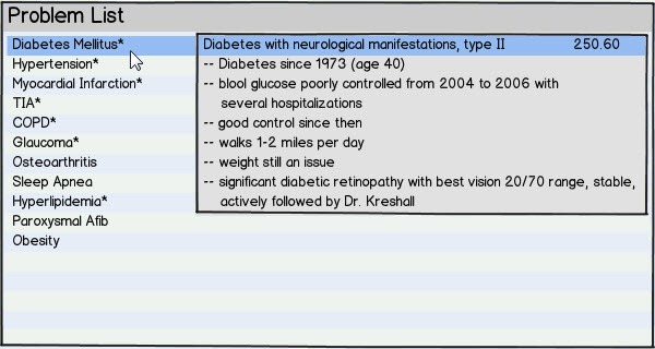
EHR Design Talk with Dr. Rick 4/23/12

April 23, 2012 Rick Weinhaus 11 Comments

Overview with Details on Demand — A Versatile Design

Let’s return to the EHR design problem we were considering in my last post. You’re a member of an EHR development team working on a new high-level EHR user interface design that displays an overview of an entire patient encounter in a single screen view. Your current user interface requires clinicians to navigate to multiple screens.

In the new design, each category of patient data (Problem List, Medications, Exam, etc.) is assigned to a relatively small pane on a single screen. Your problem is how use these small panes to display each category of data in a way that still makes sense to clinicians.

Your team discovers that a design based on small panes with horizontal and vertical scrollbars doesn’t work. Now it’s back to the drawing board.

Instead of trying to design in the abstract, it becomes clear that you need to start by looking at actual patient data and finding out how clinicians use it. You again start with the redesign of the medication pane.

Your current EHR design requires clinicians to navigate to a separate screen to see a patient’s full medication data. Such a screen is shown below for a particular patient who is taking nine medications. I have broken it into two parts so that it’s readable in this blog format.

4-23-2012 8-32-35 PM

4-23-2012 8-33-11 PM

If you want to provide an overview for your users, how would you proceed? What information is most important? What information is only occasionally needed?

Here is where you need input from your clinician users — in technical jargon, your subject matter or domain experts. You observe and talk to clinicians using your product.

Some of them want to see just the names of the medications in the summary view, while others want to see the medication name, the dose, and the instructions. Most clinicians agree that the start date, the notes, and the prescribing physician data are less important, but that they should still be readily available on demand.

So, with this input, what information would you display in a summary view? How would you display more information on demand?

Clearly, there is no single design solution to this problem. Any design will require lots of trade-offs and compromises. One possible solution is show below:

4-23-2012 8-34-27 PM

In this summary view, only the names of the medications are listed. By hovering with the mouse cursor in the header row, the clinician gets an expanded view, displaying the dose and instructions, as below:

4-23-2012 8-34-54 PM

When the cursor is moved off of the header row, the pane contracts to its original size.

Alternatively, by keeping the mouse cursor within the header row, moving it to the right and again hovering (or by a similar gesture), the clinician could get the view below displaying the complete medication data:

4-23-2012 8-35-29 PM

Note that this view has the same information content as the full screen view shown at the beginning of this post. Again, when the cursor is moved off the header row, the pane contracts to its original size.

There will be times when the clinician needs to keep an expanded view open while working with a different part of the screen. This could be accomplished by clicking with the mouse instead of hovering.

There will also be times when the clinician wants to retrieve information for just one data element or data field in a pane. The same convention of hovering with the mouse to get a temporary view or clicking to keep that view open until closed could be used:

4-23-2012 8-36-10 PM

Again, by using a mouse hover or click, further details can be viewed without expanding the entire pane:

4-23-2012 8-36-47 PM

And so forth:

4-23-2012 8-37-21 PM

These expanding pane and pop-up designs are of course familiar to users in other contexts, but many widely used EHRs, even newer and cloud-based ones, don’t support them or don’t support them consistently.

All too often, the EHR interfaces that clinicians use on a day-to-day basis are based either on small panes with scrollbars or require navigation to multiple different screens. Such designs overload working memory, leaving little for patient care issues.

Unfortunately, guidelines for EHR usability can only address these kinds of high-level design choices in general terms. Furthermore, usability testing protocols do not provide a mechanism for comparing one design pattern to another. Hence EHRs that rely on small panes with scrollbars or require navigation to multiple different screens can still get good usability ratings.

While the overview with details on demand design pattern is versatile and powerful, a major potential problem comes with it — when a pane or data field expands, it obscures information in adjacent panes. I look forward to addressing this issue in my next post.

Next Post:

Pane Management

Rick Weinhaus MD practices clinical ophthalmology in the Boston area. He trained at Harvard Medical School, The Massachusetts Eye and Ear Infirmary, and the Neuroscience Unit of the Schepens Eye Research Institute. He writes on how to design simple, powerful, elegant user interfaces for electronic health records (EHRs) by applying our understanding of human perception and cognition. He welcomes your comments and thoughts on this post and on EHR usability issues. E-mail Dr. Rick.
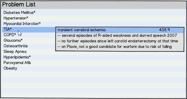
Text Ads


RECENT COMMENTS

  1. Well now if you know that Epic is paying KLAS, do tell, and give evidence! Or is this another Oracle…

  2. Well that's a bad look as the Senators contemplate filling in the House gaps in the VA Bill

  3. Fear of scorn from Mr HIStalk is so great at Oracle Towers that the webinar recording linked to in the…

  4. House lawmakers should have bought a squirrel ;-)

  5. The KLAS scores for Epic vs Oracle Health seem directionally accurate, but I wonder how CIOs would read the KLAS…

Founding Sponsors


Platinum Sponsors


Gold Sponsors


RSS Webinars

  • An error has occurred, which probably means the feed is down. Try again later.