I was born roughly 2 months after the US space program began (Explorer 1), and I've followed it all my…
EHR Design Talk with Dr. Rick 7/23/12
Pane Management — Part 2
The human visual system evolved over tens of millions of years to help our ancestors keep track of and interact with real objects in the physical world. To the extent that an EHR user interface design can harness our finely honed visual-spatial capabilities, using it will be intuitive and nearly effortless, even though the "space" we are navigating is that of data and the "objects" we are manipulating are abstract concepts.
Unless acted upon, objects in our physical world don’t move around, get larger or smaller, or change their orientation in relation to other objects. The human visual system "understands" these properties of the physical world. We are very good at constructing mental maps of what we see and using those maps to keep track of how objects are organized in space.
Unfortunately, graphical user interface (GUI) designs are not bound by the laws of physics and the constraints of the physical world. When we manipulate one object on the screen, other screen objects, for no apparent reason, can disappear and suddenly re-appear in different locations or radically change their shape and orientation.
While we might enjoy an altered set of physical rules as part of the challenge of playing a video game, it would be disconcerting, to say the least, to encounter such behavior in an EHR user interface.
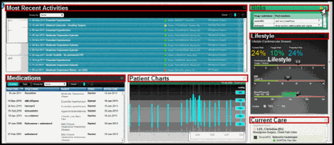
Consider the EHR design below, by a well-known healthcare software toolkit developer.
Above is the physician’s home screen for a particular patient. Six panes are used to display six categories of patient data — Most Recent Activities, Medications, Patient Charts, Risks, Lifestyle, and Current Care. For clarity, I have enlarged the font size and drawn red boxes around the title bar of each pane.
Each pane is assigned to a particular location on the screen. One at a time, each pane can be expanded and then contracted by using the mouse cursor to click on the "maximize" button at the far right of its title bar (see Risks pane above).
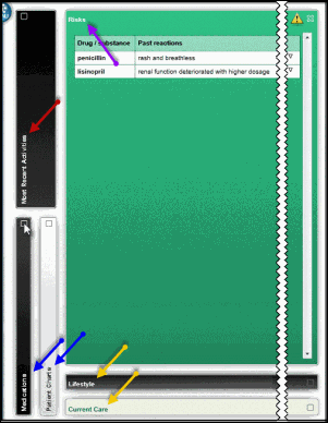
So far so good. But look at what happens to the other panes below when I do expand one pane, such as the Risks pane (purple arrow). For clarity, I have significantly shortened the horizontal span of the screen in the next two figures:
When I expand the Risks pane, all the other panes close so that just their title bars are displayed. Worse, they all change their position, size, and orientation. The Most Recent Activities pane (red arrow) and the Medications and Patient Charts panes (blue arrows) are now oriented vertically along the far left of the screen. The Most Recent Activities pane is twice the width of the others.
The Lifestyle and Current Care panes (yellow arrows) maintain their horizontal orientation and relative position, but have been shifted to the bottom of the screen and stretch along its entire extent.
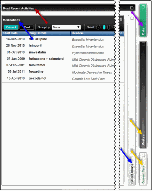
If I need to expand another pane, such as the Medications pane (indicated by the blue arrow below), all the other panes again change their position, size, and orientation:
With the Medications pane expanded, the Most Recent Activities pane (red arrow) is now oriented horizontally instead of vertically and extends along the entire top of the screen.
The Patient Charts pane (bottom blue arrow) keeps its vertical orientation, but now is displayed on the right side of screen, elongated to span the entire screen height. The Lifestyle and Current Care panes (yellow arrows) change from horizontal to vertical orientation as does the contracted Risks pane (purple arrow). In addition, the Lifestyle pane has been stretched vertically.
In fact, whenever any pane is expanded, the other, non-expanded panes somewhat arbitrarily change their position, size, and orientation in this way. This is a poor mapping. It doesn’t correspond to our mental model of the physical world. It doesn’t take advantage of our highly evolved ability to organize objects in visual space.
Instead of the design above, why not use a small overview map for orientation and navigation, as in the figure below?
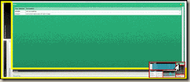
This is a more natural mapping. The positions of the six panes in this small overview map correspond to those of the home screen (first figure) and those positions remain constant regardless of which pane is expanded. Furthermore, this overview map (overlaid below, for comparison, in the lower right corner of the expanded Risks pane) takes up less than 3% of the screen area, whereas the vendor’s design (outlined by the yellow border below) uses almost 20%:
It’s not that physicians and other users can’t work with problematic EHR interfaces such as this one. Humans are remarkably adaptable and flexible, but it requires cognitive effort. It’s not just the extra second or so that it takes to find a pane in its new location. That’s the least of it.
The real problem is that, unlike computers, humans have extremely limited working memory. Having to deal with the shifting location, size, and orientation of data objects is disorienting.
Whenever we use a slot in our visual working memory for these kinds of tasks, we can no longer use that slot for clinically relevant information. It’s easy to underestimate how much this kind of EHR interface can interfere with our ability to make sense of complex patient data in the clinical setting.

Rick Weinhaus MD practices clinical ophthalmology in the Boston area. He trained at Harvard Medical School, The Massachusetts Eye and Ear Infirmary, and the Neuroscience Unit of the Schepens Eye Research Institute. He writes on how to design simple, powerful, elegant user interfaces for electronic health records (EHRs) by applying our understanding of human perception and cognition. He welcomes your comments and thoughts on this post and on EHR usability issues. E-mail Dr. Rick.


This feels right, but do you have any documentation from the psychology literature to document the effect of specific screen design variations like this and their effect on operator performance?
Dr. Rick, please skip all these steps and simply go out and design us all the perfect EMR. You have all the knnowledge, shouldn’t take long to design the perfect interface.
Dr. Rick, I think everyone appreciates your intent, but quite frankly, it feels like me opining on how the Chicago Bears should play better football.
Robert,
Thanks so much for your comment.
As you know, the fundamental science of visual processing has been studied extensively by both cognitive and neuroscientists (although many issues remain contentious and/or obscure). In contrast, the discipline of information visualization — how to make abstract data accessible by applying our understanding of visual processing to the design of interactive user interfaces — is a much newer field.
No one has done more to assemble the findings of cognitive and neuroscience in a way that provides a scientific underpinning for this new field of information visualization than Colin Ware, a researcher at the University of New Hampshire. He has written two excellent books on the subject — Information Visualization: Perception for Design and Visual Thinking for Design. This would be a great place to start.
In Information Visualization: Perception for Design (second edition, pp. 376-377) he writes:
“The benchmark point of comparison for all navigation techniques should be saccadic eye movement. This allows us to acquire a new set of informative visual objects in 100-200 msec [milliseconds]. Moreover, information acquired in this way will be integrated readily with other information that we have recently acquired from the same space. Thus, the ideal visualization is one in which all the information for visualization is available on a single high-resolution screen. . .
“. . . When simple pattern finding is needed, the importance of having a fast, highly interactive interface cannot be emphasized enough. If a navigation technique is slow, then the cognitive costs can be much greater than just the amount of time lost, because an entire train of thought can become disrupted by the loss of contents of both visual and non-visual working memories.”
To get a sense of Ware’s other research interests, visit his website: http://ccom.unh.edu/vislab/ .
Rick
Counting and Armchair QB —
Your comments would be more useful if they were substantive.
Counting and Armchair QB,
What Dr Rick is trying to do is open up a long, long overdue conversation on EHR user experience on a well read national forum. If you are not interested in the topic, then you don’t have to read it. Many of us are interested in what Dr Rick has to say, especially those of us who have to suffer through using current EHR interfaces daily.
Dr Rick,
First, your efforts are greatly appreciated by most readers. Thank you for taking the time out of your busy schedule to discuss this important topic that is basically swept under the rug by most vendors.
I have a question about this post. In one of your earliest posts you mentioned that you like T-Systems because it lays out information in a consistent manner and you were not a fan of tabbing systems because of the short working memory that humans have. Ever since that post I have been waiting to see how you were going to tackle the problem of presenting all the information that EHRs have to present without a tabbing system. It appears that you are starting to address that with this post. I think the changes you have suggested in this interface make it much more user friendly, but it basically boils down to being a tabbing system. Instead of tabs being aligned across the top or the side, you have laid the tabs out in a two dimensional matrix at the bottom right. I don’t see the difference between this and tabs. If there is one, can you please explain.
Thanks.
Anonymous —
First of all, thanks so much for your thoughtful reading, support, and comments. One of the best things about a forum like this is that it supports the rapid sharing and exchange of ideas. I also agree with you that unless you actually use an EHR in clinical practice, it is difficult to appreciate how much problematic designs interfere with patient care.
To answer your specific question, you are absolutely right that the vendor’s design in this post uses essentially the same kind of tabbing system presented in my post on limited working memory — http://histalk2.com/2012/03/12/ehr-design-talk-with-dr-rick-31212/ .
In fact, in some ways this design is worse because the “tabs” move around the screen, instead of having a fixed order and location.
All of my posts to date (with the exception of my brief excursion into world of EHR Usability Testing and User-Centered Design) have been laying the groundwork for an EHR design paradigm where most of the data for a patient encounter can be presented in a single screen view, minimizing the need for tabbing or scrolling.
As not all readers are familiar with the designs and patterns commonly found in EHRs, I felt that providing this background, rather than jumping in with a new design, would be the best way to proceed. Please bear with me. I think I will be writing one more post as background — that includes Fitts’ law among other things — before getting to the posts you are asking about.
Rick