Top News

Allscripts announces Q4 results: revenue up 2%, adjusted EPS $0.17 vs. $0.18, falling short of Wall Street estimates for both.
From the earnings call:
- The company expects to recover half of the $145 million it paid to settle Practice Fusion’s Department of Justice charges from “a variety of escrows and insurance policies” and will make installment payments through 2020.
- CEO Paul Black, when asked about potential opioid liability risk beyond the Practice Fusion settlement for pushing opioids at order entry in a contract with OxyContin’s manufacturer, said the company doesn’t know, but “so far, so good.”
- President Rick Poulton says that acute care client attrition will reduce 2020 revenue by $50 million. Black says talks with other clients who say they’re leaving represent another $30-40 million over several years.
- Allscripts will hire a corporate transformation consulting firm to review efficiency, resource alignment, and decision-making structure over the next 10-12 weeks.
- Non-EHR business represents 20% of the company’s revenue.
- Veradigm business results have been softer than expected.
- Poulton agreed with an analyst’s observation that the company’s free cash flow numbers are “pathetic” and hopes to improve them with the transformation initiative.
- Poulton will permanently add the CFO role to his president title with the resignation of Dennis Olis after two years on the job.
Reader Comments

From CoronaHIMSS20: “Re: Confirmed that Intermountain Healthcare is pulling all their staff back. Our contact there said to expect the same of other provider organizations, both from a practical view plus the optics involved. Siemens has also told its employees that they have pulled out of HIMSS and that all activities must be performed remotely if possible.” A reader told me that Partners HealthCare is also keeping its folks home. Lumiata has also cancelled as an exhibitor. We won’t really know the extent of the no-shows until we get to Orlando because most organizations won’t bother making an announcement. There’s no registration refund, just a rollover to HIMSS21 registration fees, so even HIMSS won’t know how many no-shows to expect if people don’t bother until later. It will certainly be a different environment than in years past. The burning question: will MedData have scones?
From Humana Insider: “Re: HIMSS20. Humana just banned any non-essential travel within the US for the entire month of March. That includes conferences such as HIMSS, so I’m assuming their 20×20 booth will be impacted.”
From Critical Juncture: “Re: HIMSS20. My doctor advised me not to attend due to a chronic health condition that raises my COVID-19 risk. All of my requests to cancel my HIMSS-booked hotel have been rejected even though they say they are making accommodations (no pun intended).”
From Game Afoot: “Re: HIMSS20 exhibitor cancellations. You should squat in the vacant Cisco booth, planting your Smokin’ Doc standee dead center and see if anyone notices or cares.” I received zero ROI from exhibiting, so I’m not sure I would bother even if some cancelling company donated their space. Perhaps an impromptu HIStalkapalooza-lite could be held there in silent concert mode, where we all wear headsets and dance frantically to a soundtrack that puzzled observers can’t hear. I could charge for the headsets, “curate” the tracks as the hipsters say, and donate the proceeds to Donors Choose.
From Elucidator: “Re: President Trump at HIMSS20. Politics aside, should they have invited him?” Every conference would love to have a sitting President show up to validate its existence and the importance of its attendees, and I’m sure HIMSS has extended the same invitation every year regardless of who occupies the Oval Office. I’m hoping (but not betting) that political ugliness will be absent from both sides of the podium since the keynote is supposed to inspire rather than leave attendees arguing with each other. Trivia: HIMSS will now have had two of three impeached US presidents as their keynote speaker, a record that will stand unless someone holograms Andrew Johnson. Here’s my plea – for whoever introduces the President (Hal Wolf, probably), please just get him up there without the usual beaming, glad-handing, and nervous delight at being in the rarefied air of a celebrity who just wants you to shut up and let him speak. I hate it every year when someone from HIMSS takes obviously excessive pleasure in rattling off an overly long and fawning introduction, hand-shaking (or perhaps elbow-tapping this year) with an ear-to-ear fanboy grin, and then inserting themselves into a post-talk analysis or lame fireside chat.
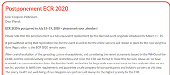
From Derek Smalls: “Re: HIMSS20. Almost all related attendee expenses are non-refundable, including registration fees that just roll over to HIMSS21. Not everyone wants to head to Las Vegas next year, and vendors will go nuts if they cancel HIMSS20 since some of them invest 50% or more of their marketing budget on just this one show. Meanwhile, Orlando theme parks remain open and draw 100,000 visitors per day, European Congress of Radiology is making no change to its March 11-15 meeting in Vienna, and we’ve had two people out of 328 million die in the US from not very many confirmed cases.” It was just announced that ECR 2020, which draws 20,000+ attendees, has been postponed until July 15-19. For HIMSS, the common answer is “stay home if you aren’t comfortable with the risk,” but I wonder how that plays when your employer is an exhibitor and you’re scheduled to work the booth? I also question the “frequent handwashing” recommendation given the large percentage of “healthcare” guys I see in the convention center’s men’s restroom who bolt for the door afterward without a sink stop, including some whose pre-departure position was sitting.
From Bonhomme: “Re: HIMSS20. If a guest in the hotel I’m staying in becomes symptomatic, could they quarantine the whole hotel? What if an attendee is found to have COVID-19 – could they quarantine the whole convention center as in the Diamond Princess?” Beats me, although Florida’s governor just declared a public health emergency after two state residents tested presumptively positive for COVID-19. Let’s hope we’re better at treatment than surveillance because we’ve certainly fumbled that. Meanwhile, I’m thinking about all the employees of Orlando hotels, restaurants, the airport, and the convention center itself who not only have crossed paths will people from everywhere in the past couple of weeks, but who also in many cases can’t afford to miss work.
From DontCoughOnMe: “Re: Amazon Web Services. Pulled out of HIMSS20 citing COVID-19, but wondering if it was related to the Trump announcement, Bezos, DoD, etc.” I think Amazon implemented a company-wide travel ban before the President Trump announcement.
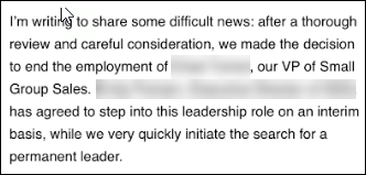
From Dr. Karma: “Re: [executive name omitted.] Fired from [company name omitted] for sexually harassing a small group sales rep. Here’s the email sent to the company.” It doesn’t feel fair for me to name the individual and company over a personnel issue, especially when the email didn’t specifically say why the person was fired. Still, he was indeed let go, an presumably for good reason.
HIStalk Announcements and Requests
I created a PDF version of my HIMSS20 guide that lists what my sponsors are doing, giving away, and presenting. Download it, print it, whatever works for you.
I planned my HIMSS conference travel this year around an “arrive late and leave early” goal, so I won’t be attending Monday’s events, including the President’s speech. Maybe someone can record it for me. Good luck if you are traveling to Orlando Monday afternoon like me since airports and local roads are going to be disrupted by the President’s visit.
HIStalk drew over 16,000 page views in 13,000 unique visits on Tuesday, the second-highest total in 16 years. The Department of Defense selection announcement on July 30, 2015 generated a few more page views, but with fewer visits, so you could argue that Tuesday was the busiest day ever.

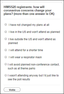
Snap poll for HIMSS20 registrants: will you attend President Trump’s keynote on Monday? I’ve disabled poll comments since I’m not interesting in fomenting disharmony, just curious about how attendees will respond to a newly added session on an odd conference day.
I’m worried about how the opening keynote by the President will set the mood of HIMSS20 when attendees are already in a down mood over COVID-19 fears, new HHS regulations, and a scaled-back conference. Opening keynotes have always been collegial, self-congratulatory, and boring in having some vendor suit babbling on to a restless crowd that is checking their watches, ready to sprint to the exhibit hall opening in a feeling of unity and purpose. It won’t be the same if we start with oppressive security precautions, protests, attendees screaming in each other’s faces, angry heckling, and watching people get removed to the cheers of others. Not to mention that the open bar is next up and there’s nothing like alcohol to stir up the political blood sport. You just know that someone’s MAGA hat will trigger an incident that will end up as cellphone video news.
The list of announced HIMSS exhibitor cancellations that I’ve heard:
Amazon Web Services
Cisco
HL7
Humana
Intel
Lumiata
Salesforce
Siemens Healthineers
TriNetX
Webinars
March 4 (Wednesday) 1 ET: “Tools for Success: How to Increase Clinician Satisfaction with HIT Solutions.” Sponsor: Intelligent Medical Objects. Presenter: Andrew Kanter, MD, MPH, FACMI, FAMIA, chief medical officer, IMO. Dr. Kanter will explore how striving to achieve the Quadruple Aim (by focusing on the provider experience) can improve clinician satisfaction and population health needs while also reducing per capita healthcare costs. Attendees will learn how to set providers up for success with new technology, the potential unforeseen consequences of purchasing without the clinician in mind, and the factors that are critically important to clinicians who are using new health information systems.
March 4 (Wednesday) 1 ET: “Healthcare Digital Marketing: Jump-Start Patient Discovery and Conversion.” Sponsor: Orbita. Presenters: Victoria Petrock, MBA, MLIS, principal analyst, EMarketer; Kristi Ebong, MBA, MPH, SVP of corporate strategy, Orbita. Does your digital front door capture consumers who search for health-related information one billion times each day? Do you have actionable steps to convert them into patients? Do you understand voice and chat virtual assistants? The presenters will explore the consumer challenges involved with finding, navigating, and receiving care, discuss why healthcare marketers need to embrace conversational voice and chatbot technologies, and describe how new technologies such as conversational micro-robots can improve engagement.
March 26 (Thursday) 12:30 ET. “How to Use Automation to Reduce ‘My EHR is Slow’ Complaints.” Sponsor: Goliath Technologies. A common challenge is that a clinician is ready to work, but their technology is not. EHRs can be slow, logins not working, or printers and scanners are offline. Troubleshooting these end user tickets quickly is nearly impossible, especially in complex environments that might include Citrix or VMware Horizon. This webinar will present real-world examples of how leading health systems are using purpose-built technology with embedded automation and intelligence to proactively anticipate, troubleshoot, and prevent end user performance issue across their IT infrastructure and EHRs.
Previous webinars are on our YouTube channel. Contact Lorre to present your own.
Acquisitions, Funding, Business, and Stock

Patient engagement and payment solutions vendor RevSpring acquires Loyale Healthcare, which offers patient financial engagement technology.
Sales
- Saudi Arabia’s King Faisal Specialist Hospital & Research Center chooses TransformativeMed to improve EHR workflow and care quality. The hospital will work with the company to develop apps for thrombolytics, oncology, congestive heart failure, and other conditions and will assist other hospitals in implementing the system.
- Continuing education and patient engagement solution vendor MedBridge will expand its integration to EHRs using Redox’s health integration platform.
People

Ed Marx (Cleveland Clinic) joins The HCI Group as chief digital officer.

OptimizeRx promotes Todd Inman to CTO.

The SSI Group hires Diana Allen, PhD (Culbert Healthcare Solutions) as president and CEO, replacing Jimmy Lyons.
Announcements and Implementations

Holy Name Medical Center (NJ) develops Harmony EHR — powered by Medicomp’s Quippe Clinical Data Engine — to replace the multiple EHRs used in its ED, ambulatory, and inpatient settings. Harmony EHR, which will be made commercially available later, will be demonstrated at Medicomp’s Booth # 3559 at HIMSS20.

Nuance and the American Medical Association will run a pilot test to see if their combined technologies – Nuance’s DAX ambient clinical intelligence and AMA’s IHMI clinical knowledge graph – can reduce burnout-causing documentation burden.
First Databank rolls out an Alexa service that allows consumers to ask questions about commonly prescribed medications, including side effects and drug interactions, in both English and Spanish. I tried it this morning and it was pretty cool – I asked, “Alexa, what is amoxicillin used for” and it gave a nice summary, leading off with “According to First Databank …” I then asked, “Alexa, who is First Databank” and it gave a consumer-oriented summary.
Privacy and Security
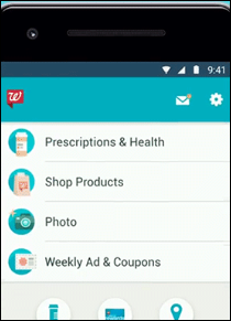
Walgreens says a bug in its mobile app allowed users to see the personal information of other users, such as name, prescription information, and shipping addresses over a week-long period in January 2020.
Other

The government of China requires citizens to use a smartphone app that decides whether they should be quarantined for COVID-19, but a New York Times analysis found that it also sends the user’s location and ID to local police for tracking. The Alipay Health Code app uses unspecified big data to assign a user QR code that is green (unrestricted movement), yellow (seven-day quarantine), or red (14-day quarantine). More than 50 million people signed up in Zhejiang Province alone, with one million of them getting yellow or red codes. Employers and housing units are denying entrance to holders of red codes and nobody has explained what it takes to make the red code go away.

In similar news that could make a great episode of “Black Mirror,” South Korea is deploying apps that use government data to show details of nearby confirmed COVID-19 patients, including date the infection was confirmed, the patient’s demographic data, and their location history. One of the apps issues a smartphone alert if the user gets within 100 yards of a location that has been visited by a COVID-19 patient.
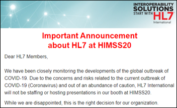
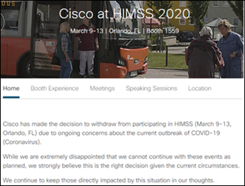
HL7 withdraws from HIMSS20 due to COVID-19 concerns. First-time exhibitor TriNetX also announced that it won’t attend, as have Salesforce, Intel, Cisco, Amazon, and Siemens Healthineers.
Apple will pay $500 million to settle a class action lawsuit that accused the company of intentionally slowing down older IPhones to compel users to buy new ones.
Families in Australia who receive a government childcare subsidy struggle to cover daycare costs after an error in the country’s Centrelink social security payments system cuts off payments to families of children it incorrectly thinks have not been vaccinated, which is a condition of the program.

The COO of Cape Fear Valley Health makes an interesting comment at a gala of one of its hospitals, as reported by the local paper for some reason: “There are just awesome people here, and very resilient folks here, and you have been through a lot of things through natural disasters. And if you work in the hospital, you know that one of those is Epic, our new electronic medical record. That was tough as well.”
Sponsor Updates
- Four strategically aligned healthcare technology venture capital funds invest in CareSignal, previously Epharmix, two of them being customer-partners.
- Nuance will partner with the American Medical Association to combine and test their respective technologies in an effort to reduce documentation burden.
- King’s Daughters Medical Center (MS) reduces ED length of stay by one hour with Meditech Expanse.
- Datica features Greenway Health CMO Geeta Nayyar, MD in its latest “4×4 Health” podcast.
Blog Posts

Contacts
Mr. H, Lorre, Jenn, Dr. Jayne.
Get HIStalk updates.
Send news or rumors.
Contact us.



























Sorry to be that guy, but "We remember the loss of Space Shuttle Columbia on its return" - Columbia exploded…