Home » Rick Weinhaus » Recent Articles:

EHR Design Talk with Dr. Rick 4/4/12

April 4, 2012 Rick Weinhaus 3 Comments

The Problem with Scrolling

Imagine that you are a member of an EHR software development team. Your team has been given the task of designing a new user interface that will provide an overview of an entire patient encounter in a single screen view.

Your current user interface requires clinicians to navigate to multiple screens to enter and review data for a single patient encounter. Many clinicians find that the navigation interferes with focusing on patient issues. Even worse, they can’t keep the relevant data in their working memory as they navigate from screen to screen (see my last post).

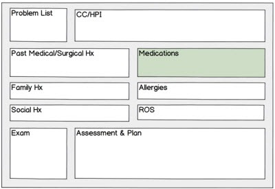
Your team starts out by drawing a rough sketch of what the new screen view might look like:

4-4-2012 3-57-15 PM


Each pane will display data. Your problem is how to display each category of data within the areas of these small panes.

Your team decides to start with the redesign of the medication pane. Your EHR’s current medication screen is shown below for a particular patient who is taking nine medications. I have resized your screen view to fit the width of this post, but in your EHR application you can easily see the entire medication table on a single screen without scrolling.

4-4-2012 3-58-24 PM


How do you display the medication data above using a much smaller pane size? One of your team members suggests a commonly used EHR design — vertical and horizontal scrollbars for each pane. Your team decides to explore this scrolling option first.

You sketch a pane with vertical and horizontal scrollbars, as below. The example below displays the upper left portion of the medication screen above. The red arrow to the right shows the position of the vertical scrollbar.

4-4-2012 3-58-56 PM


Right away you and your team realize that this design has problems. First of all, a clinician using this design would have to scroll down to two additional locations in the table (only one shown below) just to see the complete list of meds:

4-4-2012 3-59-58 PM


Similarly, she would have to scroll across to two additional locations in the table (only one shown below) to see the complete data for any particular medication:

4-4-2012 4-00-47 PM

She would have to navigate to nine different views within the pane to see all the data! As Alan Cooper points out in About Face 3: The Essentials of Interaction Design, scrolling is a form of navigation even though we don’t usually think of it as such.

Furthermore, the scrollbar design doesn’t solve the working memory problem. As soon as the clinician scrolls to a new position in the table, the previous information is gone from view. She might as well navigate to the full screen medication window.

You and your team note additional problems with the pane with scrollbars design:

  • It does not display a summary list of all nine medications.
  • The clinician can inadvertently scroll past critical information.
  • Using the scrollbars requires fine motor skills and eye-hand coordination, interfering with the clinician’s ability to focus on patient issues.
  • Text can be truncated both horizontally and vertically, making it difficult to read.
  • The scrollbars and header bar waste valuable screen real estate.
  • Depending on operating system speed, there can be latency between the scrolling action and the updated screen.

Despite the fact that the pane with scrollbars is a common EHR design element, the result is a computer-centered, not a user-centered design.

It’s back to the drawing board. In my next post, I will show some better EHR software designs for presenting multiple categories of data in a single screen view.


Next Post

Overview with Details on Demand — a Versatile Design

Rick Weinhaus MD practices clinical ophthalmology in the Boston area. He trained at Harvard Medical School, The Massachusetts Eye and Ear Infirmary, and the Neuroscience Unit of the Schepens Eye Research Institute. He writes on how to design simple, powerful, elegant user interfaces for electronic health records (EHRs) by applying our understanding of human perception and cognition. He welcomes your comments and thoughts on this post and on EHR usability issues. E-mail Dr. Rick.

EHR Design Talk with Dr. Rick 3/12/12

March 12, 2012 Rick Weinhaus 12 Comments

Humans Have Limited Working Memory

Consider a very common, high-level EHR design. The screenshots that follow are from a particular EHR, but many vendors use a similar design.

clip_image002

A row of clickable tabs at the top of the screen is used to designate the different categories of data that make up the patient visit. When a tab is clicked, the window for that category of data opens to full screen size. The tabs can be clicked in any order.


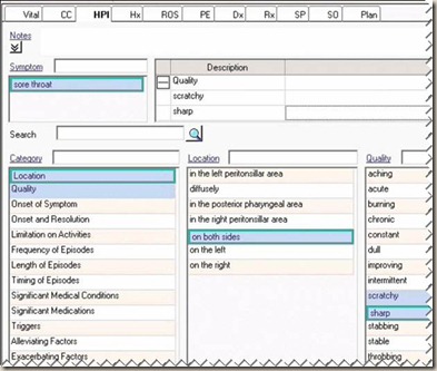
clip_image004

The screenshot above shows what I would see after having clicked on the History of the Present Illness (HPI) tab and having entered some data.


clip_image006

If I were then to click on the History (Hx) tab and enter some data, the new screen would look like the one above. The HPI data is no longer visible because the HPI window automatically closes when the Hx tab is clicked.

This EHR design is completely logical. It is also completely usable, if usability is defined as being able to easily navigate from one part of the record to another with a single click. In fact, it is a totally reasonable design if it weren’t for one problem — humans have absolutely terrible short-term (working) memory.

It used to be thought that humans could retain about seven unrelated elements in working memory, but recent work suggests that the actual number is more often in the range of four to five. In contrast, a modern computer has no problem retaining thousands of unrelated data elements in random access memory.

Given our severe limitation in working memory, this EHR design doesn’t work very well. Every time I click on a new tab, the previous window closes and that data is no longer visible. I have to carry that information in my head. Furthermore, the row of tabs itself contains no information. It just serves as a navigation tool.

In other words, this design is based on how a computer — not a human — thinks. It is a computer-centered, not a user-centered design (see my first post).

As a clinician, I need to devote my full cognitive resources to my patient’s health issues. I need to be able to retrieve information from any part of the record quickly and effortlessly. While completely logical, this very common EHR design just doesn’t do a good job of extending my working memory. From personal experience, I can tell you that using a system like this is enough to drive you crazy.

So what’s the alternative? The alternative is to design an EHR based on what humans are good at — using our visual system to make sense of the world. The data needs to be organized spatially, assigning each module to a fixed location on the screen the way that T-Sheets and other paper forms do (see my previous post). Instead of making the overview of patient data just a row of information-less tabs, display the actual data in a one- or two-screen view, allowing the clinician to see the information rather than forcing him to remember it.

Of course, every design requires compromises. If you decide to use a compact, fixed spatial layout for your high-level design, then you need to solve the twofold problem of what to display in the default view and how to display more information on demand.

In my next post, I will present an example of one widely used EHR design solution to this problem.

Next post:

The Problem with Scrolling

Rick Weinhaus MD practices clinical ophthalmology in the Boston area. He trained at Harvard Medical School, The Massachusetts Eye and Ear Infirmary, and the Neuroscience Unit of the Schepens Eye Research Institute. He writes on how to design simple, powerful, elegant user interfaces for electronic health records (EHRs) by applying our understanding of human perception and cognition. He welcomes your comments and thoughts on this post and on EHR usability issues.

EHR Design Talk with Dr. Rick 2/6/12

February 6, 2012 Rick Weinhaus 11 Comments

Why T-Sheets Work

Disclosure: I have no financial interest in T-System, Inc.

There is nothing particularly high-tech about a T-Sheet. A T-Sheet (designed by T-System, Inc.) is a particular design for a double-sided, single-page printed paper form used to chart patient visits. T-Sheets are extremely popular and have been widely adopted by emergency department and urgent care physicians.

Why do many physicians prefer using T-sheets to the more technologically advanced EHR solutions that they are increasingly being required to adopt?

There are of course many reasons. One is so basic — and is such a defining property of the paper form in general — that we tend not to even notice it: T-Sheets assign each category of data to a box of fixed size and fixed location on the page.

A second reason T-Sheets are popular is that each presenting problem (chest pain, abdominal pain, headache, and so forth) has its own customized T-Sheet template. But regardless of the specific problem and the specific data collected, the spatial layout of data categories is kept exactly the same.

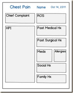
Here is an example of the front side of a T-Sheet for an emergency department visit that I have redrawn and greatly simplified to emphasize its high-level spatial design.

clip_image001

Regardless of the reason for the emergency department visit (in this case, chest pain), the box on the top right has a fixed size and location. It is always set aside for the review of systems (ROS). Similarly, regardless of the reason for the visit, the box on the bottom right has a fixed size and location. It is set aside for the family history. And so forth.

This means that once I learn where each category of data is situated on the page, I can just glance at that box to retrieve the desired information. Its position doesn’t change depending on how much data is written in the boxes above or next to it. The information remains readily available when I’m viewing a different box. I don’t have to carry it in my head.

The locations become automatic after a while. I don’t have to read the box headings. And if I need to compare the current visit to a previous one, I can just place the two T-Sheets side-by-side and glance at the same location on the two sheets to find the comparable data.

In my last post, Computer-Centered versus User-Centered Design, we saw how the spatial arrangement of data allows us to solve certain problems visually with minimal cognitive effort. But even if our task is just to take in and organize a large amount of data, a fixed spatial arrangement is a very good design.

Humans are visual animals par excellence. The human visual system is very good at organizing objects in space. T-Sheets and similar paper forms work because they enable us to use our extraordinary visual and spatial processing abilities to make sense of abstract data, even though these abilities evolved to help us organize physical objects in the real world.

Despite its simplicity, the paper form — with every data category assigned to a fixed location on the page — is a powerful cognitive tool. By allowing us to use our perceptual visual system to organize and retrieve a large body of information, it leaves our finite cognitive resources available for patient issues.

This all may seem obvious. Unfortunately, many EHR designs did not go in this direction, only in part because of technical constraints. Instead, clinicians often are required to navigate to multiple screens in order to enter or view different categories of data, as in the example below:

clip_image003

Of course paper forms have their own problems — how do you record more information than fits in a particular box, bring historical information forward to the next encounter without laboriously re-entering it, read illegible handwriting, and so forth? But still, assigning each data category a fixed screen location is a good model. So in rethinking EHR design, one strategy is to retain fixed spatial location as a high-level design element, but improve the paper design by making it interactive.

We need interactive T-Sheets.

Next Post:

Humans Have Limited Working Memory

Rick Weinhaus MD practices clinical ophthalmology in the Boston area. He trained at Harvard Medical School, The Massachusetts Eye and Ear Infirmary, and the Neuroscience Unit of the Schepens Eye Research Institute. He writes on how to design simple, powerful, elegant user interfaces for electronic health records (EHRs) by applying our understanding of human perception and cognition. He welcomes your comments and thoughts on this post and on EHR usability issues.

EHR Design Talk with Dr. Rick 1/23/12

January 23, 2012 Rick Weinhaus 33 Comments

Computer-Centered versus User-Centered Design

Within the next few years, most physicians in this country will have converted from paper-based charting to electronic health record (EHR) technology. This is an unprecedented technological change in healthcare delivery. Whether this technological transformation succeeds will in large part depend on the design of the EHR software itself.

As a physician in clinical practice, my day-to-day care of patients depends in large part on how easy or difficult it is to interact with my EHR. Like many of my colleagues, I find that while my EHR provides all the necessary functionality, using it requires too much cognitive effort. In other words, the EHR design is computer-centered instead of being user-centered.

What’s the difference between computer-centered and user-centered design? Let me give an example.

Imagine that you and your very young son have recently started playing tic-tac-toe against each other on two networked computers. Your son thinks he should be winning more games, so he proposes a change, not in the rules, but in your screen view, in order to make the odds more even.

While his screen view of the tic-tac-toe grid will remain the same, your screen view will no longer be the standard three-by-three grid, but rather will be a single row of nine boxes.

He enlists his older sister, who is great with computers, to program your new user interface. Each of you can only see your own screen.

1-23-2012 8-12-11 PM

The first three boxes in your row correspond to the three boxes in the top row in his grid, the next three boxes in your row correspond to the three boxes in the middle row of his grid, and the last three boxes in your row correspond to the three boxes in the bottom row of his grid.

So, for a particular game, your respective screen views would be as follows:

1-23-2012 8-13-43 PM

1-23-2012 8-15-02 PM

All of the sudden, you find that you’re working pretty hard just to play tic-tac-toe. You’re working hard because you can no longer ‘see’ the problem.

First you have to mentally reconstruct the normal three-by-three tic-tac-toe grid, then mentally segment your row of nine boxes into three groups of three, and then transpose each segment back onto the appropriate part of the tic-tac-toe grid that you are keeping in your head. (Alternatively, you might decide to solve the problem using a different strategy, but that would still require cognitive effort on your part.)

With a lot of effort, you’re able to stay pretty even with your son, but then your daughter introduces a second challenge — a two-second time limit for each move. At this point, your son starts winning a lot more games than you, restoring family harmony.

What is interesting about this example is that, from a logical perspective, the two screen views contain exactly the same amount of information. And, in fact, if a computer program were using an algebraic algorithm to play tic-tac-toe against you, the screen view would be immaterial.

But for humans, it is clear that the grid view works better. It works because we can literally ‘see’ the solution.

If we see a tic-tac-toe grid, we can visually superimpose horizontal, vertical, or diagonal lines at will. If we are faced with the game position below, we don’t have to compute the slope of the line passing through the two Xs or solve an equation to know whether that line would also pass through the square on the bottom right.

1-23-2012 8-16-52 PM

In other words, the human brain is an extremely powerful computer, but one that evolved to help us survive in the physical world by making sense of our spatial environment. Our brain is almost always better at solving problems visually than by using formal logical or mathematical operations.

Donald Norman, a cognitive scientist and pioneer in applying human cognition to design, has written extensively on this topic. In Things that Make Us Smart, he devotes a chapter to why certain design variants are easier for humans than others, even if the variants are formally identical. He includes one diabolical example which turns tic-tac-toe into a variant of Sudoku.

Humans enjoy solving mental games and puzzles for fun, which is why we invent things like Sudoku, but we don’t enjoy them at all when they interfere with complex tasks. Physicians need to be able to devote their full cognitive attention to patients in order to help solve their very real health puzzles.

As physicians, we need user-centered EHR designs that take advantage of our innate visual and spatial perceptual abilities and stay in the background, instead of competing with patients for our finite cognitive resources. Far too many EHR designs force us to play linear tic-tac-toe.

Next post:

Why T-Sheets Work

1-23-2012 8-09-09 PM

Rick Weinhaus MD practices clinical ophthalmology in the Boston area. He trained at Harvard Medical School, The Massachusetts Eye and Ear Infirmary, and the Neuroscience Unit of the Schepens Eye Research Institute. He writes on how to design simple, powerful, elegant user interfaces for electronic health records (EHRs) by applying our understanding of human perception and cognition. He welcomes your comments and thoughts on this post and on EHR usability issues.

Text Ads


RECENT COMMENTS

  1. Going to ask again about HealWell - they are on an acquisition tear and seem to be very AI-focused. Has…

  2. If HIMSS incorporated as a for profit it would have had to register with a Secretary of State in Illinois.…

  3. I read about that last week and it was really one of the most evil-on-a-personal-level things I've seen in a…

Founding Sponsors


Platinum Sponsors


Gold Sponsors


RSS Industry Events

  • An error has occurred, which probably means the feed is down. Try again later.

RSS Webinars

  • An error has occurred, which probably means the feed is down. Try again later.