I was born roughly 2 months after the US space program began (Explorer 1), and I've followed it all my…
EHR Design Talk with Dr. Rick 6/4/12
Special Edition: The ONC/NIST Workshop on Creating Usable EHRs — Part 1
On May 22, ONC and the National Institute of Standards and Technology (NIST) jointly sponsored a workshop in Gaithersburg, Maryland on Creating Usable EHRs: A User-Centered Design Best Practices Workshop.
If any major vendor CEOs had attended, I think they would have come away with the mission to make EHR usability, defined broadly, a top priority of their organization.
In his opening remarks, Farzad Mostashari, National Coordinator for Health Information Technology, noted that when talking with clinicians across the country, the number one issue he hears is that their EHR is unusable, that "the system is driving me nuts."
Broadly speaking, EHR usability is about suiting EHR design to human requirements and abilities, not the other way around. I’ll start by giving three examples.
Example #1
Pediatric cardiologist David Brick presented an error-prone EHR design that could lead to a catastrophic result in a safety critical environment, a neonatal ICU. In the medication module of the EHR, the column containing the names of the medications is too narrow, presumably to conserve screen space. Consequently, the names of medications are truncated. In the example below, the truncated forms of the medications amiodarone and amlodipine are visually similar.
Administering amlodipine to a neonate when amiodarone was intended is an error with potentially fatal consequences. One can see how a neonatologist might confuse the two, especially in a high-stress clinical setting.
Example #2
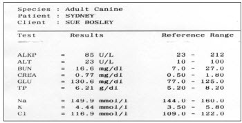
As part of his talk, Bentzi Karsh, Professor of Industrial and Systems Engineering at the University of Wisconsin-Madison, conducted an audience-participation experiment by presenting the same data set in two different formats. (The 2 figures that follow are printed with permission from Sue M Bosley, PharmD, CPPS.) Our task was to determine as quickly as possible how many of the lab values were outside the normal range for the patient below. Try it:
In the view above, it took us anywhere between 15 and 45 seconds to determine the number of out-of-range labs and 20% of us came up with the wrong number. Furthermore, we were so focused on the task at hand that not one of the 150 of us noticed that the patient was a dog.
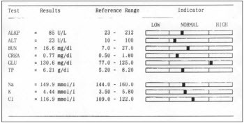
Then the same data was presented in a format better optimized for visual processing:
Using the visual display of the same information, we all identified the out-of-range lab value in less than 3 seconds and there were no errors.
Example #3
The third example comes not from a presentation, but from a conversation over lunch with fellow attendees of the workshop. Jared Sinclair, an R.N. and developer of iOS applications for bedside nursing, was telling us about a widely-used workaround that hospital-based nurses have devised to deal with an EHR design problem.
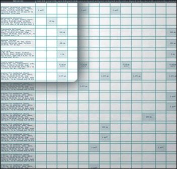
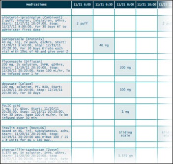
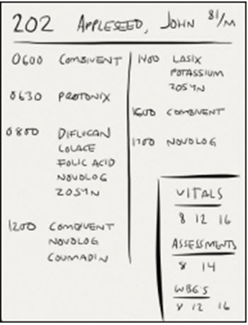
One of the major tasks of hospital-based nurses is to make sure that each patient assigned to them gets the right medications at the right time of day. The EHR medication screen view that nurses see is called a Medication Administration Record (MAR). It serves both as a schedule for administration and as a tool to document whether and when medications were actually given. Jared was kind enough to create the MAR mock-ups below (shown as an overview and then a zoomed-in view) based on the design of several widely-used EHRs:
What nurses need for each patient, however, is a portable list of medications organized by the time of day those medications should be administered. Because most EHRs don’t provide this alternate view of the data, at the beginning of every shift nurses create their own paper-based lists (see example below):
***
Each of the three examples above represents a disparate aspect of EHR usability. The fact that they are so different helps explain why designing usable EHRs is so difficult.
Further complicating the discussion is the fact that usability can be defined in a number of ways. If usability is narrowly defined, it can focus on the kinds of issues in example #1 to the exclusion of the kinds of issues in examples #2 and #3, which in fact may represent greater risks to patient safety.
The three examples above just scratch the surface of the EHR usability problem. To better understand these issues, I recommend a superb viewpoint paper in JAMIA discussing EHR usability and related issues. The two lead authors, Bentzi Karsh and Matt Weinger, spoke at the workshop. Their points are easy to follow. In my opinion, their paper should be required reading for vendors, administrators, and clinicians alike.
Broadly speaking, the field of usability can be divided into two parts:
- User-Centered Design (UCD), which deals with the design process, and
- Summative Usability Testing, which evaluates and validates designs toward the end of the design process.
While these two components can be seen as parts of a continuum, in practice it is helpful to separate them.
I was glad to see that the ONC/NIST workshop focused on User-Centered Design – the process of creating usable EHRs – as opposed to focusing narrowly on testing protocols. Of more consequence, in its March 2012 Notice of Proposed Rule Making (pp. 13842-3), ONC states that a significant first step toward improving overall usability is to focus on the process of UCD (as opposed to mandating formal summative testing).
For me, there are two major questions:
1) What exactly is User-Centered Design (UCD)?
2) What role, if any, should ONC play in regard to UCD and EHR usability?
I look forward to sharing my thoughts on these issues in my next post.

Rick Weinhaus MD practices clinical ophthalmology in the Boston area. He trained at Harvard Medical School, The Massachusetts Eye and Ear Infirmary, and the Neuroscience Unit of the Schepens Eye Research Institute. He writes on how to design simple, powerful, elegant user interfaces for electronic health records (EHRs) by applying our understanding of human perception and cognition. He welcomes your comments and thoughts on this post and on EHR usability issues. E-mail Dr. Rick.


I am surprise that Farzad Mostashari gave Example 1 as a deficiency of an EHR system(or maybe I am not reading this article correctly)
First, confusing these two entries, in my opinion is similar to confusing New Jersey, New York and New Mexico. They all start with “New” but doesn’t mean they all mean the same thing. Second, it is becoming evident that Physicians are not willing to automate their poor practices because this could point the figure at them, not the EHR. It’s about time that Physician take the time to review what they do/say and stop pointing the figure at other entities such as vendors, government, politicians.
As Seth Myers would say…. REALLY!!!
Rick, wonderful presentation. I am especially grateful that you used the term, “error prone EHR”. I, and my colleagues, have been suffering with the usability defects in the devices of the major vendors for more than 7 years.
We call the error prone features of these CPOE devices their errorgenicty. We have come up with an errorgenicty index, and yes, no vedors’ device comes close to the ideal of not causing new errors by competent clinicians.
You can bet your bottom dollar that the amylodipine amiodarone vignette in real life caused trouble, or even a death.
Is it not shocking that devices that are so errorgenicty are allowed in the market place without the vendors be held accountable?
Not only are the truncated names in the first example confusing, but the “amlopi” is misspelled. The medication is “Amlodipine” (aka Norvasc). Not “Amlopidine”. The two names would be almost indistinguishable if the “amlopi” read “amlodi” if it were spelled correctly.
But then again, you gotta look at the big picture. The CEO of the company selling these exorbitantly priced systems has to pay for his yacht and plane somehow. A neonate’s life here and there is just collateral damage.
[From Mr. H] Good catch on the spelling. I fixed the example given.
1) What exactly is User-Centered Design (UCD)?
http://www.nist.gov/manuscript-publication-search.cfm?pub_id=907313
2) What role, if any, should ONC play in regard to UCD and EHR usability?
A better question is: What role should vendors play? Whether this industry is able to police itself or not will determine whether the FDA is forced to step in.
So far, the response has been deception, denial and resistance to even modest requirements (as proposed in MU Stage 2): http://www.himssehra.org/docs/20120503_EHRACommentsONCMU2NPRM.pdf
§ 170.314(g)(4) – Safety-enhanced design
Public Comment:
We applaud the fact that the proposed certification criteria for this topic are not prescriptive with
respect to design, and we also support ONC’s general approach, given this proposal, to start
with a relatively small set of functions, focusing on those with a higher likely impact on patient
safety. At the same time, we are very concerned that publishing data on a small set of
capabilities under particular configurations would lead to invalid comparisons across systems.
As stated in this AHRQ report, “Usability studies are often difficult to generalize or transfer
across settings, in part because MMIT effectiveness is linked strongly to the culture, institutional
leadership, and other situation specific factors. Therefore, applicability of findings related to
usability is problematic in MMIT applications.”
(http://www.ahrq.gov/clinic/epcsums/medmgtsum.htm)
Given the concerns outlined above and below, we, suggest an alternative approach in which
vendors attest to and document their current processes for incorporating user-centered design
(UCD) practices into their software design, as well as any UCD approaches used for currently
certified products, but not publicly publish findings from specific tests. We also believe that this
type of summative testing, as used in the referenced NIST template, can catch the most basic
usability errors, but is unlikely to have a significant impact on patient safety relative to cost. We
are, therefore, in favor of broadening the criteria to include other, formative UCD techniques
instead of just summative testing as valid for certification.
We have strong objections to the requirement for retrospective UCD analysis and application. In
many cases, the core functionality and user interfaces associated with some of the specified
applications and features were developed several years ago and continuously refined through
user feedback over the ensuing years – feedback that has addressed usability issues, albeit not
necessarily according to formal UCD protocols. To be required to go back and redevelop widelyused
and user-recommended content as mandatory for certification would be an unnecessary
and valueless burden, forcing EHR Association members to pull resources from development
work of higher priority to our end users. We strongly object to this requirement.
More examples are at a ten part series I posed several years back on the “mission hostile user experience” or HIT, starting here.
My major comments about the NIST initiative are that:
1. It is a good thing.
2. It is long overdue (note the understanding of software usability in the mid-1980’s quotes from the Air Force in the aforementioned series’ part 1.
3. The fact that consideration of usability as an extremely high priority has only taken hold in the second decade of the 21st century reflects far more widespread, systematic, structural problems in the health IT industry and “ecosystem.” Leadership, ethics, valuation of human rights, regulation, quality control, to name a few.
Those structural problems need to be addressed as much as the usability issues.
“Really!!” says:
It’s about time that Physician take the time to review what they do/say and stop pointing the figure at other entities such as vendors, government, politicians.
When a patient is harmed or killed as a result of, or due to a contribution of, poor EHR usability, it is my hope the defense will have people like you answer interrogatories or take the stand on answering of questions such as I advise plaintiff’s lawyers to ask.
Make sure your house is in someone else’s name.
Dr. Mostashari noted that the number one complaint he hears is that EHRs are driving users nuts with all the “clickity, clickity, click”. He emphasized that, ideally, an EHR is not just a documentation system, but, rather, a “workflow engine”. He emphasized this point: “It’s a workflow engine! And if workflow is working against users, making them do things that don’t make sense…That’s the number one challenge for EHRs to fulfill their full potential!” (Disclaimer: I added the quotes for emphasis. While it may not be word-for-word accurate, it is a very close paraphrase of what he said.)
As a long-time proponent of EMR workflow management systems and EHR business management systems, relying on workflow engines executing user-customizable workflow definitions, I couldn’t agree more.
User-centered design applied to EHRs with workflow engines and definitions will more quickly achieve more usable workflow than EHRs without workflow engines and definitions. In a later presentation, EHR event logs were mentioned as a potential source of data about user behavior. Workflow engines create even more detailed event logs full of time-stamped who-what-why-where-when-how information that can be used to spot usability problems. Techniques such as process mining should be brought to bear on these logs to improve workflow usability. What are the tasks that are taking too long (physicians staying late to complete records), aren’t being completed (potentially threatening patient safety), or are being completed incorrectly (also potentially threatening patient safety) or redundantly? (wasting financial resources)
Even if insights into the root causes of problems with EHR workflow usability can be teased out of EHR event logs and other data (such as from usability testing), without malleable workflow, there is no way to turn insight into improvement without expensive rewriting, recompiling, retesting, redeploying and (in some cases) retraining too. Many EHRs are customizable in many respects, but their workflows are not nearly as customizable as those of workflow management systems and BPM suites, from which healthcare IT should beg, borrow, or steal ideas and technology.
So, if the number one problem with EHRs is usability, and the number one problem with EHR usability is workflow, then Dr. Mostashari is right. EHRs are, or should be (and can be!) true workflow engines helping EHRs achieve their full potential.
P.S. I see considerable evidence for diffusion of BPM ideas and technology into healthcare IT. However, in comparison to hot topics such as mobile, social, and cloud, they haven’t burst upon the scene. I hope that current intense interest in improving EHR workflow usability will accelerate mainstream appreciation for the virtues of what BPM researchers call “process-aware information systems” or PAISs.
Re: Charles Webster, MD, MSIE, MSIS (@EHRworkflow) Says:
Can you provide more info/references on BPM suites?
This starts “If any major vendor CEOs had attended…” To me, this implies that no major vendor CEOs attended the workshop. Is this true? If so, this highly disappointing. I am hopeful that all major vendors sent an executive level representative but also afraid that many did not. The examples above are clear… usability is not something that EHR vendors should be ignoring.
There’re lots of BPM vendors. Quite a few BPM vendor directories too.
http://www.google.com/search?q=BPM+vendors
Tough to isolate is the subset explicitly or obviously relevant to healthcare. Only a minority of BPM vendors have that content online, though the amount is steadily growing.
I use http://twitter.com/EHRworkflow to tweet links at the intersection of EHRs, HIT, BPM, workflow, usability, safety and productivity (plus science, popular culture, and bad jokes, so as to not seem unremittingly narrow in focus 🙂 For folks on Twitter and interested in this topic it might be worth following for while. Though recently I’m finding that I’m tweeting more-and-more about clinical natural language processing (there are interesting connections between NLP and workflow).
At http://ehr.bz I archive the best links (minus unrelated science, most popular culture, and all bad jokes). There’s over a thousand links to material at the interface between healthcare and BPM.
If you search for “BPM” within the webpage, there are a couple hundred instances. Many of these links lead to material about, and links to, specific BPM vendors. I also link to web content about EHR problems (workflow, usability, safety, productivity) that I feel might be solved by BPM tech. I’m thinking of creating a similar, more vendor-oriented, directory, as I’m beginning to find it hard to keep track all the potential players myself! Other folks may find it useful: Stay tuned!
For a general overview of BPM, BPM suites and relevance to health IT and EHRs I could do worse than cite my own blog posts on the topic.
EMRs and EHRs Need to Solve “The BPM Problem”: Why Not Use BPM to Help Do So?
http://chuckwebster.com/2010/05/ehr-workflow/emrs-ehrs-and-clinical-groupware-need-to-solve-the-bpm-problem-why-not-use-bpm-to-help-do-so
Well Understood, Consistently Executed, Adaptively Resilient, and Systematically Improvable EHR Workflow
http://chuckwebster.com/2009/11/ehr-workflow/well-understood-consistently-executed-adaptively-resilient-and-systematically-improvable-pediatric-primary-care-emrworkflow
Hope you may find some of the above helpful.
–Chuck
I recall checking the attendee list and seeing representatives from a number of major EHR vendors.
Thanks, everyone for your comments.
Really!! — An alternative to blaming the physician for this type of error is to see the problem as resulting from interactions of the entire system — a systems view of error — which certainly encompasses the physician’s data entry error, but also encompasses other factors such as the EHR design, the physical environment, the workplace culture, and so forth.
Carol Thomas, MD — Carol, thanks! There is no doubt that some EHR systems are more error-prone than others. The problem I have been struggling with is whether these differences can be measured “objectively” for all cases, or whether the differences are task- and context-dependent. Can you conceive of formal test criteria for the CPOE devices that would correspond to your “errorgenicity index,” and if so, what would the criteria be.
Anon — Thanks for catching my spelling error and thanks, Mr. H for fixing it.
Curious in Wisconsin — There were certainly representatives from a number of the major EHR vendors. I don’t know how many were executive level. Other major vendors were conspicuously absent.
Anonymous, MIMD, and Charles Webster, MD — Thanks for your comments and links. I am digesting your comments and also reading as many of your references as possible.
Rick
That the vendors are not responsive to users’ needs despite being informed of the usability problems for years is evidence for the need of aggressive oversight by the FDA.
I