I was born roughly 2 months after the US space program began (Explorer 1), and I've followed it all my…
EHR Design Talk with Dr. Rick 5/14/12
Pane Management — Part 1
The quantity of detail is an issue completely separate from the difficulty of reading. Clutter and confusion are failures of design, not attributes of information.
— Edward Tufte, Envisioning Information
We’ve been considering a high-level EHR user interface design that employs multiple panes within a single screen to display all the categories of data in a patient encounter.
In my last post, I discussed how mouse hovers or clicks can be used to expand and contract panes as needed. Excellent reader comments by Dr. Gregg and Dr. Robert Lafsky have made it clear it would be helpful to explore the limits of how much EHR data can be effectively displayed within an unexpanded pane.
In other words, can a relatively small pane present information at a high data density without creating clutter and confusion? Can multiple panes on a single screen be used to display most of the relevant data for a patient encounter, even before expanding or moving panes?
In my T-Sheet post, we explored one advantage of a single page or single screen view of the data. Each category of data is assigned to a fixed location on the page, allowing us to organize abstract data using our highly-evolved capacity to remember things by their spatial location.
A second advantage of a single page or single screen view is that we can rapidly access information by simply redirecting our gaze toward any part of the display. These rapid eye movements, lasting about a tenth of a second, are so integral to the way we take in and process information that most of the time we are not even aware of them.
Because data anywhere on a single page or screen is immediately available by using these ‘saccadic’ eye movements, we can simply retrieve it rather than remember it. Thus, the single screen design largely eliminates both the working memory problem and the cognitive costs of navigation. It also reduces complexity by reducing the total number of EHR screens needed.
For a single screen design to work, however, the individual panes need to be thoughtfully designed. Each pane needs to present a high density of data without clutter. We have already seen one problematic pane design, based on scrolling, that does neither.
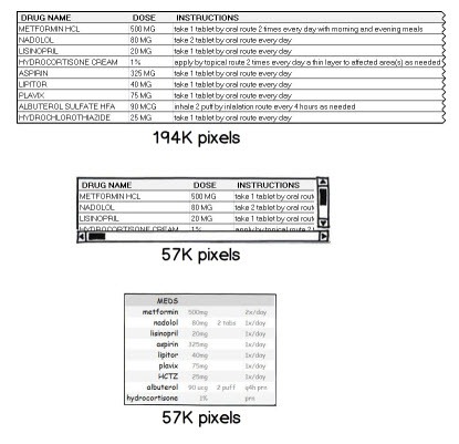
Let’s return to the medication data set we’ve been working with. Here is the first part of the medication screen:
This design has lots of problems:
- It uses hard-to-read, all upper-case lettering for the drug names and dosages.
- The numeric values in the dosage column are not right aligned.
- The instructions are written in a form more appropriate for the patient than the clinician.
- The instructions present different classes of data (number, route, frequency, and notations) as text rather than in separate columns.
- The horizontal lines separating the rows of data are distracting.
- There is no way to re-order the medications in the list by importance, class or physician preference.
- Other than using all upper-case letters, the names of the medications are not emphasized.
- Abbreviations are underutilized.
- No effort has been made to eliminate redundant or self-explanatory information.
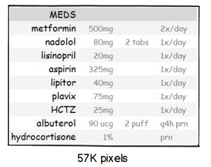
Many of these problems are improved with the redesign below:
Surprisingly, this small pane display contains almost as much information as the larger display above. Not only is this redesigned pane easier to read, it requires only 30% of the screen area needed for the first design. The redesign also uses the same number of pixels as the problematic pane with scrollbars design. Here are all three designs shown at the same scale:
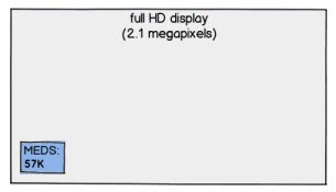
Many computers now support monitor resolutions of 2.1 megapixels (full HD) or higher. The redesigned pane, at 57K pixels, takes up less than 3% of a full HD display:
By taking advantage of the greater display resolution now available and by using multiple well-designed small panes, the amount of EHR information available in a single screen view can be significantly increased.
Well-designed small panes can present detailed EHR information accurately, efficiently and simply. Multiple high data density panes displayed on a single screen, with each pane assigned to a fixed location, is an extremely powerful design. It allows us to use two highly-developed components of our visual system — our capacity to organize data spatially and our ability to access that data using rapid eye movements — to make sense of complex EHR information.
The take-home lesson is that no matter how good a user interface is, less is better. Eye movements are by far the easiest and most efficient way for humans to access or retrieve visual information. They beat using a mouse or other device to navigate, scroll, or expand panes hands down.
There will still be times, however, when expanded panes are needed. I look forward to discussing this issue in my next post.
Next Post:
Pane Management — Part 2

Rick Weinhaus MD practices clinical ophthalmology in the Boston area. He trained at Harvard Medical School, The Massachusetts Eye and Ear Infirmary, and the Neuroscience Unit of the Schepens Eye Research Institute. He writes on how to design simple, powerful, elegant user interfaces for electronic health records (EHRs) by applying our understanding of human perception and cognition. He welcomes your comments and thoughts on this post and on EHR usability issues. E-mail Dr. Rick.


I am delighted to see you addressing this sort of design.
Here’s my observation: Spreadsheets stink as a fundamental paradigm for presenting clinical data. I can understand why they are so attractive to non-clinical developers who want to be able to extract from the database and populate Cell X with the return. But clinically, they just stink.
Spreadsheets remind me of the the earnest and bright medical student who is clever enough to accumulate every data point he’s been trained to accumulate and at the end still has no idea if the patient is sick or not.
Dr Rick,
I have been avidly reading your columns since the first one. You make great comments and hopefully developers are incorporating them.
I do have a bone to pick with you, however. All your columns have been about the “Medication List.’ That is undoubtedly an important part of the clinic note and I know you have to start somewhere small when you are just starting your Usability column, however, I would like to see you address other areas of the note. Medication lists are small and, though they come from a list of 8000 possible meds, that is still a finite list that computers are built to look through efficiently (Ajax, etc.)
Doctors spend 80% of their day in the “History of Present Illness”, “Physical Exam” and “Plan” portions of the note. An HPI can be anywhere from 1 line to 100 lines or more. The HPI and PE can have millions of possible entries that the are difficult to reduce to finite number of choices that computers are so good at manipulating.
One of the main reasons for bringing EMRs into the healthcare mix is to collect structured data so that it can be warehoused and analyzed and hopefully discover cost saving measures that we were otherwise unaware of.
Usability has many definitions, but I think a practical definition is a system that allows “detailed, structured data entry as fast as dictation.” By “detailed” I mean a note that actually tells you something about the patient when you come back and read it a month from now as opposed to the 10 pages the computer will spit out at you full of generic junk that today’s EMRs are so proficient at. Data has to be structured if we are going to analyze it and it has to approach the speed of dictation if you expect doctors to use the system.
The medication list lends itself to structured data entry nicely. The HPI, PE and Plan don’t. I would love to see your thoughts on these areas of the clinic note.
I am very interested in your ideas as someone that both works with drug info UI issues and also is an end-user (part-time) of an EHR. I think you’ve had some great ideas that I may try to put into use. One concern I have with this most recent post, however, is using abbreviations for drug names, in this example HCTZ for hydrochlorothiazide. The Institute for Safe Management Practices (ISMP) has documented many examples of serious, even fatal, errors when abbreviations of drug names were utilized in prescribing. ISMP and other government regulators have been working with vendors and EMRs to NOT use abbreviations for drug names to reduce confusion and prevent errors. I understand the want to use abbreviations to reduce space, but the safety concerns of misreading or misunderstanding an abbreviation, even a common one, are too great to continue to use them in practice.
I’ll keep reading and hopefully pick up some ideas for my UI issues, thanks for your work in this area.
As an aside, you have to be careful when extolling the virtues of “high resolution” monitors when it comes to text.
Back in the day when 320×200 was the norm, you could show a font 8 pixels high and have it be very readable. These days a font 8 pixels high is unreadable.
IMO, text should be described in terms of “inches” (0.25″ or some such) or “centimeters”…the eye can only discern a character so small before readability is compromised.
For displaying data visually/graphically, let’s say growth charts, higher resolution is better as you’re looking at rough trends of various points, and not trying to read actual text. A growth chart in 320×200 would have been painful (if not unusable), however at 1024×768 and up, it becomes far more usable as the distance between points can be represented and the points stand out more clearly (and more points can be shown on a single screen).
If you really want to make use of high resolution switch to displaying data graphically (not always easy with clinical data).
Additionally, removing the vertical lines, and going with the “green bar” look makes sense, however if any of those columns can be sorted (lets say you include a column for date prescribed), you may still want to keep the vertical lines in the header so as to visually delineate the column being sorted on.
A lot of good insight. However, the trend seems to be toward portable tablets. So we are talking pretty small screens. How do you address that?
Also, with touch “hover” does not work as there is no mouse pointer. There are ways around that, but I don’t think anything will be as efficient as the mouse hover effect.
I also appreciated Skeptics spreadsheet comment. I was just having a conversation today with our CFO about usability and he just couldn’t see that a nice table of all black text on a white background wasn’t a good idea.
Skeptic — Thanks for your comment. There is no doubt that spreadsheet-type displays for EHRs are frequently not well thought out. Rather, as you note, they are just as an easy way to populate individual cells. Among other things, the clunky box boundaries and vertical and horizontal lines separating the cells compete with the data for attention and reduce the ‘data to data-ink’ ratio.
That being said, well-designed tables, organizing data by columns and rows, can give visual emphasis to the most important data and can be a good design tool. I used Microsoft Excel to generate the redesigned table in this post.
Anonymous — Thanks. You correctly surmise that I will be addressing other parts of the patient encounter in future posts. I agree that the HPI, PE, and Plan don’t lend themselves to the kinds of displays that work for the medication list.
Because the term ‘usability’ is defined in so many different ways, some of them quite specific, I prefer the more comprehensive term ‘interaction design.’
Interested pharmacist — You raise a very important issue regarding the use of abbreviations for the names of medications. I was wondering if anyone was going to bring this up. I agree that in general it is a mistake to abbreviate the names of medications and perhaps it should never be done. The ISMP website gives some compelling examples of serious errors that can arise from this practice.
That being said, it’s not at all clear to me that using the particular abbreviation ‘HCTZ’ is likely to be confused with their example of ‘HCT250 mg’ designating ‘hydrocortisone 250 mg,’ especially if the user can hover over ‘HCTZ’ to see the full name displayed.
One could make the argument that a user might be more likely to confuse the full spelling of hydrochlorothiazide with medications with similar names such as hydrocortisone, hydrocodone or hydroxychloroquine.
Mahna Mahna — This is an important issue.
You are correct that if two monitors have the same screen area but one is higher resolution than the other, then the higher resolution monitor will necessarily have more pixels per inch. However, by using a larger monitor for the high resolution display (but keeping the viewing distance the same), the two monitors can have the same number of pixels per inch but the higher resolution monitor will display more data. It’s as if you had two smaller monitors side by side.
For instance a 16″ monitor with resolution of 1366×768 is a 1.05 megapixel display. A 23″ monitor with resolution of 1920 x 1080 (full HD) is a 2.07 megapixel display — almost twice the pixel count. Yet, the number of pixels per inch is almost exactly the same for the two monitors (98 versus 96). Assuming that the users is viewing the monitors at the same distance, the higher resolution monitor with the larger screen area can display twice the amount of data, with the same clarity, as the lower resolution monitor.
You’re right about keeping the headers for sorting. However, sorting alphabetically, by date prescribed, by prescribing clinician and so forth is not always relevant. What would be more useful is to allow the clinician to re-order the medications by their clinical importance by dragging-and-dropping, a functionality lacking in many EHRs.
Jim — You bring up excellent points.
Following up on my comment above, if a small tablet is high resolution (for instance full HD) but is held close enough, it would also display data with the same clarity (the same angle subtended between pixels) as a larger monitor at a further distance. In practice, many physicians can’t focus or work comfortably at this short a focal length. Furthermore, the screen buttons and other screen tools would also need to be smaller, but because our fingers stay the same size when we hold something closer, these high resolution tablets would be more difficult to use.
I believe that many portable devices do support a hover function or its equivalent, but again, the size of the user’s finger relative to the tablet screen and the fact that a mouse-driven screen cursor comes to a point both make hovering with a mouse and monitor easier than with a touch screen tablet.
Rick