Healthcare data sucks - that song turned my Friday to Friyay!!! Gave me the much needed boost to get through…
EHR Design Talk with Dr. Rick 9/17/12
A Single-Screen EHR Design for the Patient Encounter
The benchmark . . . for all navigation techniques should be the saccadic [rapid] eye movement. This allows us to acquire a new set of informative visual objects in 100-200 [milliseconds]. Moreover, information acquired in this way will be integrated readily with other information that we have recently acquired from the same space. Thus, the ideal visualization is one in which all the information for visualization is available on a single high-resolution screen. – Colin Ware, Information Visualization: Perception for Design
I would like to bring together some of the user interface designs we have been considering and propose for discussion a single-screen EHR design for a patient encounter. Before presenting the design itself, it is useful to recall the design concepts covered in previous posts:
- The human visual system is very good at organizing data spatially (Why T-Sheets Work; Pane Management – Part 2).
- We excel at grasping patterns and seeing relationships among data elements when they are presented in a single view, but have limited capacity to remember these elements when they are distributed across multiple screens (Humans Have Limited Working Memory).
- The most efficient way to navigate visual space is by using rapid (saccadic) eye movements (Fitts’ Law).
- Using a large, high-resolution screen supports navigation by saccadic eye movement (Pane Management – Part 1).
- When we do need to navigate using a mouse or other input device, we can reduce the cognitive costs by making the targets large and reasonably close (Fitts’ Law).
- It is often easier to grasp patterns visually than mathematically or verbally (Computer-Centered versus User-Centered Design).
- It’s easier to find patterns and solve problems with data presented compactly and grouped visually – using columns, rows, and formatting – than with data presented as free text (Pane Management – Part 1).
- Using vertical and horizontal scrollbars to navigate small panes requires cognitive effort and doesn’t solve the working memory problem (The Problem with Scrolling). It is preferable to display an overview of the data and use mouse hovers or clicks to display details as needed (Overview with Details on Demand).
The Design
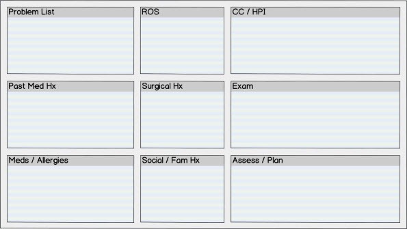
A large single screen with high resolution, for instance 1920 x 1080 pixels (full HD), is used to display all the categories of data for a patient encounter on a particular date. Each category of data is assigned to a pane of fixed size and location on the screen:
Because humans are able retain about nine spatial locations in visual working memory (although we can only remember simple visual objects or patterns contained in about three to five of them), a set of nine panes arranged in a 3×3 grid was chosen for the high-level design.
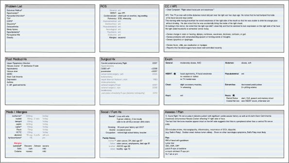
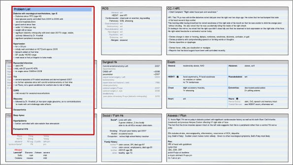
The figure below shows this same screen design populated with data from a patient encounter:
Click on the thumbnail below to see the design at higher (but not full) resolution:
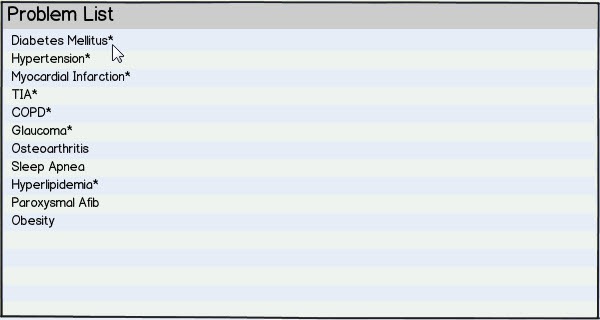
The figure below shows the Problem List pane:
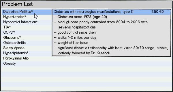
A marker (for instance, an asterisk) indicates that more detail is available for a data field. Detail can be displayed by hovering or clicking, as shown below for Diabetes Mellitus:
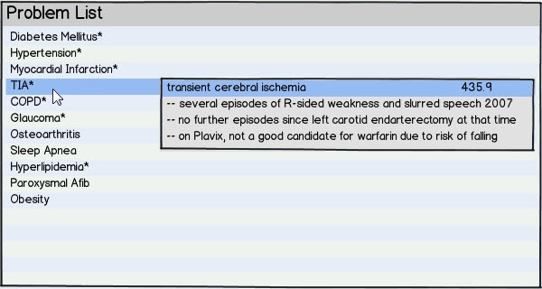
and for transient ischemic attack (TIA):
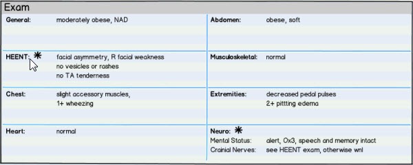
The same high-level design is used for all panes, as in the Exam pane below (size slightly reduced):
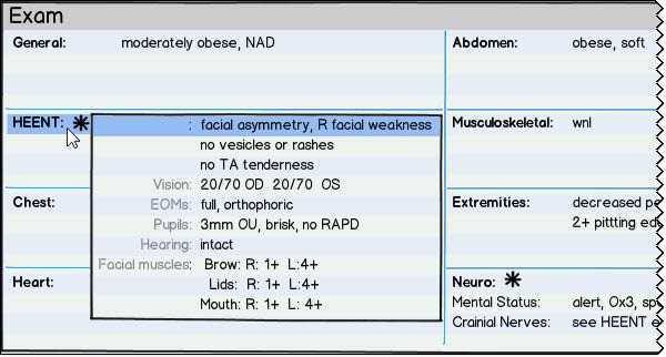
Again, hovering over or clicking on a line with an asterisk brings up more detail for that data field:
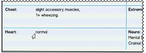
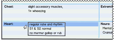
The design allows default or normal findings to be summarized:
while still making the full default text available on demand:
Expanded Panes:
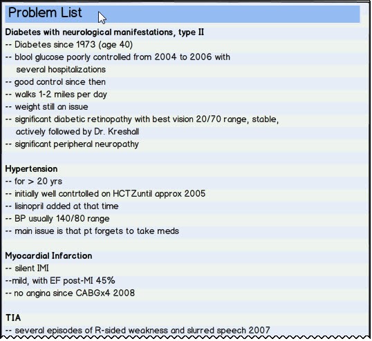
As an alternative to expanding individual data fields, all the data fields within a pane can be simultaneously expanded by hovering or clicking on the pane’s title bar, as shown below for the Problem List:
An expanded pane will necessarily obscure adjacent panes, as below:
Even in this case, context is at least partially preserved because of the large high-resolution screen.
Design Considerations
Expanded data fields:
- In order to maintain as much context as possible, data fields within an individual pane expand only to the minimum size required.
- More than one data field within a pane can be expanded at the same time, provided that the expanded fields don’t overlap.
Expanded panes:
- In order to maintain as much context as possible, panes expand only to the minimum size required.
- More than one pane can be expanded at the same time, provided that the expanded panes don’t overlap.
- The same single-screen design is used both for data entry and subsequent data review. Any pane can expand for data entry and then contract to its original size.
I would propose that this kind of single-screen design for a patient encounter, with all its interactive capability both within panes and among panes, should be thought of as the chart note. In this design, there is no separate text-based or PDF "completed note," except as needed for use outside the EHR.
The design above is a sketch – a design being considered, reformulated, and reworked. I tried to design it based on an understanding of how the human brain best takes in, processes, and organizes information. Its purpose is to generate discussion and debate. I look forward to your comments and suggestions.
Finally, there is a major caveat that comes along with the single-screen design presented here. A patient’s electronic health record is a longitudinal record, while the design above represents a snapshot in time. More on this in coming posts.

Rick Weinhaus MD practices clinical ophthalmology in the Boston area. He trained at Harvard Medical School, The Massachusetts Eye and Ear Infirmary, and the Neuroscience Unit of the Schepens Eye Research Institute. He writes on how to design simple, powerful, elegant user interfaces for electronic health records (EHRs) by applying our understanding of human perception and cognition. He welcomes your comments and thoughts on this post and on EHR usability issues. E-mail Dr. Rick.

Interesting concept making use of all the principles; however, with the current layout, I find my eye naturally gravitates to the center of the screen: the surgical history. This might be fine for a surgeon, but as an internist that area of the screen is least useful to me. I would propose moving the items on the rightmost third of the screen (CC, Exam, A/P) to the center third, since these are used most often.
I think this would work…if I could project it on the wall. It’s not readable and the 1920×1080 requirement eliminates 99% of the tablets/laptops in use in the wild.
The concept is sound, let’s see what you do with 1280×960 or even smaller.
The design presented here has actually been part of Sunrise Clinical Manager since version 4.0. It is known as the Clinical Summary and is based on a set of tiles that can be customized for content, position and layout. You can also collapse and expand tiles and tiles can access external data using SQL, .NET or Web Services. Further you can right click on a tile and execute an action – such as place an order, jump to detailed information, etc. This capability has been continually evolved through Sunrise 5.5 and is considered a key differentiator.
Users are not required to use this interface, but is an option and many users during my time at Eclipsys, did elect to use this as their “home page” as opposed to the patient list. The design can become an information overload scenario, so you need to choose wisely in terms of what you place on the screen, but thankfully, due to the role based security and personalization options in Sunrise Clinical Manager, a single user, type of user, unit or facility can have a different layout that makes sense for their own personalized needs, yet under the covers the system will assure adherence to any EBM or other best practices or policies the institution has adopted or is pursuing.
All information presented here is public information and previously disclosed. Wouldn’t want to get my ass sued by some nimrods…not that I know of any.
Any web-based software will have to deal with varying resolutions, browsers, operating systems, etc. It’s accepted that multiple interfaces will be developed into the product before reaching market to work for as many users as possible.
Looking past the semantics of resolutions (don’t worry, your front end developers will handle that) I am more interested in taking “pane/widget/applet” UI a step further. With JSON strings we can now normalize data to translate list values into graphical representations, and I am very curious as to how physicians respond to such dashboard inspired interfaces.
Zafirex, KK Downing, John Gomez, and Dustin — Thanks so much for your comments!
Zafirex — I was trying, as much is possible, to maintain the flow from left to right and from top to bottom, consistent with the conventions of written English and with the paradigm of reviewing historical data prior to starting the SOAP note. One solution to placing the SOAP note in a central location would be, after reviewing the past histories, to simultaneously expand the CC/HPI, Exam, and A/P panes horizontally so that they occupy both the center and the right side of the screen.
KK Downing — Due to the limitations of web posting, it was not possible to display the design at full 1920×1080 resolution, but all nine panes are easily readable, for instance, using a 23″ 1920×1080 monitor.
The issue is both screen resolution and the screen size. My design would not work well for small laptops or for tablets, because you would have to navigate to too many screens just to see the data for a patient encounter.
And even if a tablet had the same number of pixels per inch as a large monitor (a tablet is almost always higher), a 1280×960 screen would still only provide 60% of the screen real estate of a 1920×1080 screen.
John Gomez — I have not seen the Sunrise Clinical Manager design. It sounds like it has some very nice features. When tiles expand, do they expand to full screen size? Do they need to be manually resized? When tiles collapse, do they collapse to just a title bar? How is the information overload problem handled? Is it possible just to display summary data for each of the tiles, with details available on demand?
Dustin — You wrote: “With JSON strings we can now normalize data to translate list values into graphical representations, and I am very curious as to how physicians respond to such dashboard inspired interfaces.”
I would think that the physician response would depend on the specific graphical design, but as you know, I generally prefer graphical representations of data.
Rick
Dr. Weinhaus –
Yes you can expand to full screen, and then resize to their original size. You cannot dynamically set the size (like you can with say a window in MAC or Windows by grabbing the edges). The information overload is really a matter of configuration, meaning it is up to the user or Clinical Systems Designer to think about how to design the tile layout and information presented. My opinion is that the product shouldn’t limit the user, rather provide options. For some, they may want 100s of tiles (I know that is silly, but just for discussion) and other s may want just 3 or 4 tiles, you can accommodate both, through configuration and personalization settings.
You can present just summary data, then dive down – for instance a fishbone graph and then click on the elements. Trending charts and then switch to a table view. You can even launch MLMs, scripts and database lookups to provide custom views and layouts.
The sad part of SCM is that most of the people that have it, sell it, deploy it, don’t actually know it’s real power.
If you want to see the tiles in action, you can reach out to Dr. Rick Mansour, who is the CMIO at Allscripts. He can be reached at Rick.Mansour@Allscripts.com. Good luck and please let me know if you have any other questions or need anything. Good stuff you are doing!
John
Dr Weinhaus
I developed a very similar dashboard interface at the Jules Stein Eye Institute (JSEI) at UCLA.
Upon clicking the “header” of each of section, that section would expand to full screen, allowing for more data review and data entry of that particular type.
The biggest problems were:
1) Screen size. This could only function on a 22″+ 1920×1080 monitor. It simply was not readable on a smaller screen size. Unfortunately, Apple’s marketing juggernaut has convinced most healthcare IT folk and physicians that the iPad is the end-all be-all of healthcare IT UI. This is despite that fact that the re are probably more failed iPad trials in hospitals than successful ones.
2) In my experience, most doctors find this to be too overwhelming. The doctors at JSEI liked it because JSEI was an academic medical center that attracted top physician talent – these doctors saw the most complex patients and needed a global view of all major eye related problems. However, we rolled out a similar function to 1-2 doctor shops and they despised it because it was simply too much for them. All they wanted was a very simplistic SOAP note summary and lightweight dashboard with IOP graphing for Glaucoma patients.
A couple of other thoughts:
For larger environments, the one key thing your proposed dashboard is missing are intelligent filters. The MDs at JSEI always wanted to be able to filter what they entered against everybody else. And to compare resident and fellow data against attending data.
Kyle,
What you describe is very interesting!
First of all, it is clear that this type of design requires a large high-resolution screen. I share your viewpoint that iPads and similar tablets won’t work for this kind of design.
One difference between the JSEI design and the one I proposed is that in my design, panes only expand to the minimum size needed, preserving context.
I agree that it is easy for such a design to become overwhelming, which is why I suggest overview with details on demand for data fields and panes. I think one of the challenges of any good EHR is to present information at a high data density but without clutter. A multi-pane design with each data category assigned to a particular pane does not necessarily need to cause clutter or information overload.
Intraocular pressure (IOP) graphing is very similar to blood pressure graphing. Without being able to easily determine what medications a patient was on when the IOP measurement was taken, and similarly, without being able to able to see whether the patient actually had taken those meds on that day, I find the graphs not very useful.
Finally, there are ways of filtering by doctor — for instance, by using different font colors, or by having a separate screen for each physician involved — most of the information would be the same, but the history, exam, and assessment/plan could differ.
Thanks so much for your note! If possible, please send some screen shots.
Rick