Today's post contains the phoenixes rising from the ashes of the post COVID telehealth era. There's two things that destroy…
EHR Design Talk with Dr. Rick 4/23/12
Overview with Details on Demand — A Versatile Design
Let’s return to the EHR design problem we were considering in my last post. You’re a member of an EHR development team working on a new high-level EHR user interface design that displays an overview of an entire patient encounter in a single screen view. Your current user interface requires clinicians to navigate to multiple screens.
In the new design, each category of patient data (Problem List, Medications, Exam, etc.) is assigned to a relatively small pane on a single screen. Your problem is how use these small panes to display each category of data in a way that still makes sense to clinicians.
Your team discovers that a design based on small panes with horizontal and vertical scrollbars doesn’t work. Now it’s back to the drawing board.
Instead of trying to design in the abstract, it becomes clear that you need to start by looking at actual patient data and finding out how clinicians use it. You again start with the redesign of the medication pane.
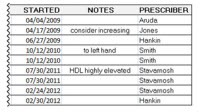
Your current EHR design requires clinicians to navigate to a separate screen to see a patient’s full medication data. Such a screen is shown below for a particular patient who is taking nine medications. I have broken it into two parts so that it’s readable in this blog format.
If you want to provide an overview for your users, how would you proceed? What information is most important? What information is only occasionally needed?
Here is where you need input from your clinician users — in technical jargon, your subject matter or domain experts. You observe and talk to clinicians using your product.
Some of them want to see just the names of the medications in the summary view, while others want to see the medication name, the dose, and the instructions. Most clinicians agree that the start date, the notes, and the prescribing physician data are less important, but that they should still be readily available on demand.
So, with this input, what information would you display in a summary view? How would you display more information on demand?
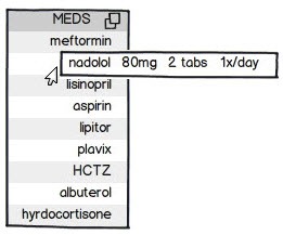
Clearly, there is no single design solution to this problem. Any design will require lots of trade-offs and compromises. One possible solution is show below:
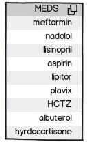
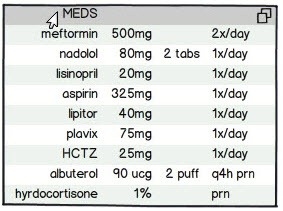
In this summary view, only the names of the medications are listed. By hovering with the mouse cursor in the header row, the clinician gets an expanded view, displaying the dose and instructions, as below:
When the cursor is moved off of the header row, the pane contracts to its original size.
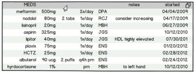
Alternatively, by keeping the mouse cursor within the header row, moving it to the right and again hovering (or by a similar gesture), the clinician could get the view below displaying the complete medication data:
Note that this view has the same information content as the full screen view shown at the beginning of this post. Again, when the cursor is moved off the header row, the pane contracts to its original size.
There will be times when the clinician needs to keep an expanded view open while working with a different part of the screen. This could be accomplished by clicking with the mouse instead of hovering.
There will also be times when the clinician wants to retrieve information for just one data element or data field in a pane. The same convention of hovering with the mouse to get a temporary view or clicking to keep that view open until closed could be used:
Again, by using a mouse hover or click, further details can be viewed without expanding the entire pane:
And so forth:
These expanding pane and pop-up designs are of course familiar to users in other contexts, but many widely used EHRs, even newer and cloud-based ones, don’t support them or don’t support them consistently.
All too often, the EHR interfaces that clinicians use on a day-to-day basis are based either on small panes with scrollbars or require navigation to multiple different screens. Such designs overload working memory, leaving little for patient care issues.
Unfortunately, guidelines for EHR usability can only address these kinds of high-level design choices in general terms. Furthermore, usability testing protocols do not provide a mechanism for comparing one design pattern to another. Hence EHRs that rely on small panes with scrollbars or require navigation to multiple different screens can still get good usability ratings.
While the overview with details on demand design pattern is versatile and powerful, a major potential problem comes with it — when a pane or data field expands, it obscures information in adjacent panes. I look forward to addressing this issue in my next post.
Next Post:
Pane Management

Rick Weinhaus MD practices clinical ophthalmology in the Boston area. He trained at Harvard Medical School, The Massachusetts Eye and Ear Infirmary, and the Neuroscience Unit of the Schepens Eye Research Institute. He writes on how to design simple, powerful, elegant user interfaces for electronic health records (EHRs) by applying our understanding of human perception and cognition. He welcomes your comments and thoughts on this post and on EHR usability issues. E-mail Dr. Rick.



Nice, Dr. Rick. Thanks.
These are every day, real world problems that hamper efficient workflow. Without design considerations similar to what you describe, Dr. Rick, many physicians most certainly are experiencing countless micro thought- and process-interruptions all day long. Such simplifications for use-on-demand are imperative to keeping docs’ brains on a patient-centric focus, not a process-centric focus which is what happens with every scroll or click.
Concerning the “when a pane or data field expands, it obscures information in adjacent panes”: if clicked to maintain the open state, it could be made drag-able until closed to allow for unhiding covered information. (But, you probably address this even better in your next post!)
I hope all EMR engine designers are taking notes from your posts. Please keep ’em coming.
Interesting design. Of course, a display designed in that fashion needs a set of well designed reports, because a screen print will not provide enough detail to satisfy the clinician.
I was wondering since the last post where you’d be going with this, hoping beyond hope that you would in fact offer up the single-column drug name list as an option. So as a frequent hospital consultant I’m pleased, because that’s what I need to see when I’m trying to put a new case together, and all those details get in the way. From a practical standpoint, to the experienced eye the drug list is the usable problem list.
Lincoln Farnum, Dr. Gregg, Kitty Alone, and Robert Lafsky —
Thanks so much for your feedback!
Dr. Gregg, I couldn’t agree more. I think it’s hard to grasp how stressful using some EHRs can be unless you’ve experienced it first-hand. Your column on HIStalk Practice is great. I look forward to your thoughts on my next post.
Kitty Alone, thanks. When you write “a screen print will not provide enough detail to satisfy the clinician,” do you mean the clinician using the EHR or an outside clinician? If it’s a clinician outside the practice or EHR, I agree. If it’s a clinician using the EHR, I would think that well-designed interactive panes would provide the full detail of reports but in a more usable fashion.
Robert Lafsky, thanks so much for your comment. As you note, an overview is often better than a detailed view, especially if details are available on an as-needed basis. I think that you’re absolutely right, that a single-column medication list can often be the best way to get a summary of a patient, especially if the EHR problem list module is not well designed.
Rick
“Furthermore, usability testing protocols do not provide a mechanism for comparing one design pattern to another.”
Do tell why usability testing protocols wouldn’t provide a mechanism for comparing one design to another? That’s kind of the point…
Dr. Rick, I have to ask, which EMR do you use in your practice? Hover functionality is common in modern EMRs and has been around for years. Everything you describe is correct, but has been done in some form or fashion in a currently existing EMR.
Rick —
Thanks for your comment. To my knowledge, CCHIT is the national organization most active in EHR usability testing.
The CCHIT 2011 Usability Testing Guide for Ambulatory EHRs defines usability as “the effectiveness, efficiency, and satisfaction with which the intended users can achieve their tasks in the intended context of product use.”
http://www.himss.org/content/files/cchit_usability.pdf
As I read the CCHIT guide, each EHR is tested individually against the same set of usability guidelines and best practices, but not against any other product. Two EHRs could have quite different designs but still get good usability ratings.
As an analogy, think of a usability rating protocol for boats. Both a powerboat and a sailboat might get good usability ratings in areas such as “cockpit layout is efficient and intuitive,” or “handles well in heavy seas,” and so forth, even though their high-level design is fundamentally different. While the usability protocol may be able to determine that one powerboat is more usable than another, or that one sailboat is more usable than another, it doesn’t necessarily compare powerboat design to sailboat design.
Getting back to EHRs, I believe that it is generally easier to evaluate the usability of mid-level and low-level EHR design elements than to evaluate high-level ones. In fact, the CCHIT guide makes an implicit, perhaps unexamined assumption about what the correct high-level EHR design should be.
The CCHIT guide states that before the usability testing begins, “at the beginning of the inspection process, the applicant [i.e., vendor] will orient the CCHIT jurors and proctor to the following: The overall screen layout for common screens (e.g. patient summary, prescribing, results review) . . . ”
In other words, the CCHIT testing protocol implicitly assumes that high-level EHR design should be based on the paradigm that each major data category gets its own screen. I am questioning this paradigm. As I have suggested in my posts, assigning each category of data to a separate screen and requiring users to navigate between them is a fundamentally problematic design because humans have limited working memory.
If any usability experts are reading this and would like to weigh in, it would be greatly appreciated.
Rick Weinhaus, MD
Counting – Thanks for your comment.
When I was first contemplating the idea of writing a column on EHR design, I decided that it would be important for me to post with my real name and identity, both for credibility and accountability.
Given this decision, it does not seem appropriate for me to name or write about the particular EHR that I happen to be using. First of all, to do so might give readers the false impression that I am writing about my particular EHR as opposed to writing about widespread EHR design issues. Secondly, it is the design issues themselves that interest me and hopefully interest my readers.
That being said, I am always happy to write about and give credit to good designs. If you or other readers are aware of EHRs with particularly good design elements, please feel free to share them in your comments or by e-mail to me directly. I would love to devote posts to discussing and sharing such designs.
Expanding panes and hover functionality are of course design patterns present in some, but by no means all EHRs. When they are present, they are not necessarily major aspects of the design. Furthermore, many of the most widely used EHRs are based on older software development tools and lack both expanding panes and hover functionality.
To say that everything I describe is correct, but has been done in some form or fashion in a currently existing EHR, misses the point. The goal is to use these patterns to build simple, powerful, elegant EHR design solutions that help clinicians and improve patient care.
Rick Weinhaus, MD
Dr. Rick,
I have found your posts to be most interesting and useful. As a former systems designer and software entrepreneur I have ‘lived’ many of the issues you bring up.
But one concern not covered yet is the legal one. Here’s the legal conundrum that I see just around the corner. As you probably know all the big IT companies are in the process of suing each other over software design patents. The last one I read about was Apple suing Samsung over a box (or circle) at the bottom of a screen used to turn the unit off. Can’t get more basic than that.
In the healthcare world this is also happening. I recently saw where one big ERM vendor has a patent on the basic process of scheduling a patient. I would bet that there are at least three vendors out there filing patents on processes you describe (if you have not filed already!) and as soon as we all agree that ‘hovering’ is the best usability approach and implement it, we can expect a waterfall of legal cease and desist letters!
Hence, I strongly suggest you copyright and file patents on all your suggestions and put them in the public domain…quick.
FLPoggio — Thanks so much for your comment.
The collective inventing of new cognitive tools is a uniquely human endeavor. I am fortunate to be able to participate in this work, as it applies to EHR design, through this column. I thank Mr. H for his support and for providing a platform, editorial expertise, and numerous ideas.
You comment raises many thorny issues. There’s a great article by Eric von Hippel from MIT on open versus closed models for information exchange and innovation: http://www.interaction-design.org/encyclopedia/open_user_innovation.html
In it, he outlines some advantages of the open model.
Rick